0 members and 792 guests
No Members online

» Site Navigation

» Stats
Members: 35,442
Threads: 103,075
Posts: 826,688
Top Poster: cc.RadillacVIII (7,429)
|
-
 Absolutly Wasted Absolutly Wasted
This is called an 'Adbusters' ad parody. It's one of several I did for a client and is aimed at drink-awareness. It's a parody of an Absolut advert that was flying around New York City not too long ago. I did it because I liked the typographical elements of the original, so I did something similar-but not the same (which is what an adbust parody is about).
-
It looks pretty nice, I suppose.
Latest:

-
The thing below 'Wasted' And above 'The absolute' looks a bit choppy :/
overall its nice.
-
Yeah I think I did somethingthat b0rked the quality when I shrunk it from an A1 poster D:
-
um, i dont like the stroked words. i can see the whited edges on the other words.
Fur's Gift BOOOO EVERYONE

-
 Originally Posted by KidBuu

um, i dont like the stroked words. i can see the whited edges on the other words.
Whited edges?
-
Swedish boose is dangerous >u<
Clean piece!
He mans that the shapes above "the absolut" has white stroke around it when it's overlaping the text.
Last edited by cc.RadillacVIII; 01-23-2010 at 04:00 AM.
-
The "O" in World and "The Absolut" look a bit odd, but it's a very nice and clean piece. 
It also seems like Wasted is a bit thicker then the other letters. It seems to draw too much attention.
-
[QUOTE=Nutter;468839]The "O" in World and "The Absolut" look a bit odd, but it's a very nice and clean piece. /QUOTE]
Yeah, it does. Don't blame me for that, though :P Blame the typographer who created the typeface. The reason I used this typeface is because it's the typeface used on bottles of Absolut, it's their corporate font.
-
Originally Posted by RadillacVIII
Swedish boose is dangerous >u<
Clean piece!
He mans that the shapes above "the absolut" has white stroke around it when it's overlaping the text.
Ah! That's intentional as it was one of the features of the original piece. The origina's was even more extreme, however.
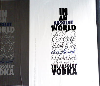
I wanted to tone mine back a bit (the idea is to make it look similar, not idential) and give it a bit more clarity. Stuff like this is more about the message than the design.
Similar Threads
-
By Takken in forum Digital Art
Replies: 4
Last Post: 01-04-2010, 09:08 AM
-
By Tooms in forum Sigs & Manips
Replies: 8
Last Post: 04-17-2008, 04:23 PM
 Posting Permissions
- You may not post new threads
- You may not post replies
- You may not post attachments
- You may not edit your posts
-
Forum Rules
|


 Reply With Quote


