GFXVoid Graphic Design Forum

Remove Text Formatting
Loading...

» Online Users: 26,370

0 members and 26,370 guests
No Members online

» Site Navigation

 > FAQ

» Stats

Members: 35,442
Threads: 103,075
Posts: 826,688
Top Poster: cc.RadillacVIII (7,429)
Welcome to our newest member, Lekelindids
Results 1 to 3 of 3
  1. #1
    Join Date
    Sep 2007
    Location
    Nottingham, UK
    Posts
    226

    Default One Nation Under CCTV

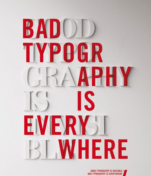
    Simple with a clear message.


  2. #2
    Join Date
    Dec 2006
    Posts
    1,270

    Default

    Haha I had to look up what CCTV was (my first thought was Closed Caption Television).
    However, once I did, I understood it, and got the message. Very clear, very clean and you did a great job of making it actually seem like it came from a security camera.
    I like the style of the text in the center aswell, its a good reminder that everything doesn't have to be clean flowing text.

    GJ overall. Great piece.
    Fav:


    Newest:


  3. #3
    Join Date
    Sep 2007
    Location
    Nottingham, UK
    Posts
    226

    Default

    Quote Originally Posted by [PHXN] New001 View Post
    Haha I had to look up what CCTV was (my first thought was Closed Caption Television).
    However, once I did, I understood it, and got the message. Very clear, very clean and you did a great job of making it actually seem like it came from a security camera.
    I like the style of the text in the center aswell, its a good reminder that everything doesn't have to be clean flowing text.

    GJ overall. Great piece.
    Thanks. If you're interested in doing that style of typographical layout there's an important rule to remember
    (since most people don't know how to do it properly). The trick is to break up the syllables.
    However there are a few words where you must include two syllables in one line in order to avoid it looking
    TOO patchy. For example

    Syll
    a
    Bles

    Looks horrid, so you have to go with

    Sylla
    Bles.

    Same for the word Typography

    Typ
    O
    graphy

    Just doesn't work.

    Typo
    graphy

    looks much better.

    instead. The trick is to go with your gut. Sometimes it'll work sometimes it wont.

    This poster sums it up quite nicely.


Similar Threads

  1. vnv nation sig
    By ClouDStalker in forum Sigs & Manips
    Replies: 2
    Last Post: 08-09-2008, 12:33 PM
  2. Across The Nation
    By Lumix in forum Digital Art
    Replies: 10
    Last Post: 06-21-2005, 01:27 PM

Posting Permissions

  • You may not post new threads
  • You may not post replies
  • You may not post attachments
  • You may not edit your posts
  •  
Powered by vBadvanced CMPS v4.1.1