


This isn't so much a tutorial as an informative article. It's a 'womans skirt' article:
Long enough to cover the essentials but short enough to hold your interest.
In my First Tutorial I said that a typeface that is not legible is not truly a typeface.
While this is certainly the rule when it comes to editorial design, it's not strictly true.
Visual communication works on many levels indeed and, when it comes to typography, it's not merely what you're writing down,
but how you're writing it and the sort of typeface you're writing it with. The concept of legibility changes from period to period.
We might find, for example Blackletter hard to read, but if you lived in pre-war germany, it would have been the dominant typeface on most everything.
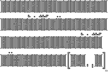
Rick Payner said once that it is our familiarity with typefaces that accounts for their legibility. Take this typeface for example:
Janus Moire is not strictly legible, but you recognise it as a maze or mazes so, as a typeface, it works. It communicates.
If you look up some of the gods of typography you'll find they all created stuff that wasn't legible,
but still had a recognition to something.
Food for thought reading:
Illegible: David Carson cannot not communicate.


 Reply With Quote