0 members and 2,654 guests
No Members online

» Site Navigation

» Stats
Members: 35,442
Threads: 103,075
Posts: 826,688
Top Poster: cc.RadillacVIII (7,429)
|
-
 hmm, i dont know hmm, i dont know
CnC please.
 think i messes up lighting here. think i messes up lighting here.
trying a realism conceptual piece
-
sorry but i really dont like the top 1. however i love the bottom 1, the lighting is pretty damn awesome but i suggest you add a lil more depth. also i think that around the neck area it looks a little blurred or LQ. but awesome job. kiu
-
no 1 needs flow, depth and quallity. the lines don't work imo and overall it is to bright...
no 2 has nice atmosphere, but i'd temper the light a bit.
From scratch, just smudging the XL way
-
Not really a fan of those 2, second one is better thou.
The reason I post is because I have a question.
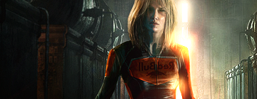
Why is the Red Bull text mirrored/backwards? ")
-
the lighting in the 2nd one is intense
-
ty for comments,
the first one i was experimenting trying to make up some godray/heavenly glow lighting thingy to go with the angel.
@Radi it was llike that on the render when i got it from the pack
-
Hehe Aight!
Then I suggest you to mirror it back thou it's only confusing now. If the light etc don't match up then, just flip the whole sig 
-
sorry man 1st one looks like begginner stuff, colors are dull compo, no depth no lightning and so on
however i love 2nd one mad simple and with good colors, i admire how you managed to blend it quite well without any effect..what i would have done differently is to move that gloving thing more behind her head just a bit
Similar Threads
-
By DanielGFX in forum Sigs & Manips
Replies: 2
Last Post: 06-12-2009, 03:20 PM
-
By robgasm in forum Digital Art
Replies: 2
Last Post: 03-20-2008, 07:21 AM
-
By Riddleb0x in forum Sigs & Manips
Replies: 3
Last Post: 12-11-2006, 03:24 PM
-
By shodan in forum Digital Art
Replies: 6
Last Post: 08-19-2005, 05:06 PM
-
By dragoneye in forum Sigs & Manips
Replies: 10
Last Post: 04-29-2005, 06:50 AM
 Posting Permissions
- You may not post new threads
- You may not post replies
- You may not post attachments
- You may not edit your posts
-
Forum Rules
|


 Reply With Quote


