0 members and 3,881 guests
No Members online

» Site Navigation

» Stats
Members: 35,442
Threads: 103,075
Posts: 826,688
Top Poster: cc.RadillacVIII (7,429)
|
-
 Everybody's favorite webslinging superhero. Everybody's favorite webslinging superhero.
normally dont do vertical sigs, but i figured i'd give it a try
CnC would be welcome 
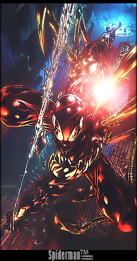
thanks in advance, greetz sparda
-
To bright and to much gaussian blur, if thats what you used.
The text placement is not the best, keep it closer to Scarlett Spidey so it wont steal all the focus.
You got a nice minimalistic comic feeling.
-
i like it just think that light is a bit too bright
-
reduced the blur, and made the light less bright, also changed the placement of the text
but im not quite sure where to place it, since the canvas is pretty full.
-
Thats better 
Might wanna change the color of the text to red, black, blue or make it a clip mask.
-
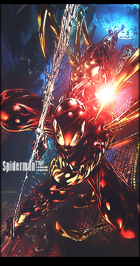
alright il that, thanks for the feedback so far guys
edit: mhm what do you guys think about something like this
i think i like it better then a solid red/black, but it may be to distracting?
Last edited by Sparda; 02-06-2010 at 08:55 PM.
Reason: edit
-
-
I would keep V1 text, except make it white. That's just me though, and it's only a very minor complaint, you're a great tagger and this is one of your best, kiu.
-
Me Like v2 better But like Kotora said White text would look good on it
-
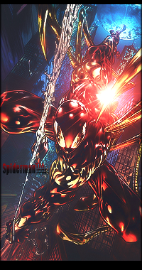
thanks for the comments and feedback guys
its realy helpfull and motivational
@kotora il try the V1 text in full white.
Similar Threads
-
By Freedom in forum Sigs & Manips
Replies: 6
Last Post: 12-29-2007, 10:16 AM
-
By Chucks in forum The Void
Replies: 17
Last Post: 05-21-2007, 01:00 AM
-
By TSM in forum Sigs & Manips
Replies: 2
Last Post: 06-01-2006, 02:28 PM
-
By Arkanian in forum Sigs & Manips
Replies: 8
Last Post: 07-07-2005, 03:33 PM
 Posting Permissions
- You may not post new threads
- You may not post replies
- You may not post attachments
- You may not edit your posts
-
Forum Rules
|


 Reply With Quote


