0 members and 26,370 guests
No Members online

» Site Navigation

» Stats

Members: 35,442
Threads: 103,075
Posts: 826,688
Top Poster: cc.RadillacVIII (7,429)
|
-
-

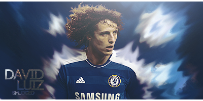
It's a good thing that you try a new style.
This tag is a little bit monotone. The only color I see is red.
Try to mix some colors that match with eachother.
Also you need to work on your blending, The render doesn't blend well into the BG.
Try to create some more and better effects by using some c4d's.
If you follow some tuts you will learn the technics to make a good sig.
Follow some of them and improve you photoshopskills.
Keep it up mate! 
-

 Originally Posted by cs4pro

It's a good thing that you try a new style.
This tag is a little bit monotone. The only color I see is red.
Try to mix some colors that match with eachother.
Also you need to work on your blending, The render doesn't blend well into the BG.
Try to create some more and better effects by using some c4d's.
If you follow some tuts you will learn the technics to make a good sig.
Follow some of them and improve you photoshopskills.
Keep it up mate! 
kk thx bro but any tuts u could recommend me for blending and not to do monotone wise? cause after looking at all my sigs... they are all monotone and i cant figure out how not to do it  so any recommended tuts would be great so any recommended tuts would be great 
Favorite and Most Recent  :

-

a simple basic way to blend renders a little is to get a soft brush (like 20/50 pixels large)
and erase a little along the edges of the render very carefully at about 15% opacity.
do be carefull not to overdo it, specialy at important places like the face.
there's probably other ways to do it, but this is something i often times use.
-

just do a lot off tuts dude! there are plenty here. while doing them you'll learn lots of shit. if you are not happy with an outcome, start again!! go for quallity rather then making fast tags... in the end you will see that it pays off. 
From scratch, just smudging the XL way
-

over sharpened, just a tinsy bit tho
i want more highlights (whites mainly).... probably just me but i always think of speed lines in cartoons as being white, so i feel like he's... melting in lava or something right now... thats probably just cause of my traumatic cartoonless childhood tho (wasnt allowed to watch tv til i was like... 12)
the lines of motion take away from his face, and i love the expression he's giving, (i are amazed {jealous} of how much emotion cartoonists can convey through a person's face TT_TT) i think that should be the point of focus, but its too dark to really get a good look at.
other than that, it was done amazingly well. the lines of motion match up perfectly with the image, and they work really well with the object, the background is nice and simble but not boring either. great job  oh and i like the text :O oh and i like the text :O
Similar Threads
-
By Cap'n Jazz in forum Sigs & Manips
Replies: 0
Last Post: 10-26-2008, 04:55 PM
-
By Coolman in forum Support
Replies: 2
Last Post: 06-19-2008, 01:29 PM
-
By Killer in forum Digital Art
Replies: 2
Last Post: 12-11-2005, 10:27 AM
-
Replies: 4
Last Post: 06-26-2005, 02:21 PM
 Posting Permissions
- You may not post new threads
- You may not post replies
- You may not post attachments
- You may not edit your posts
-
Forum Rules
|


