GFXVoid Graphic Design Forum

Remove Text Formatting
Loading...

» Online Users: 23,435

0 members and 23,435 guests
No Members online

» Site Navigation

 > FAQ

» Stats

Members: 35,442
Threads: 103,075
Posts: 826,688
Top Poster: cc.RadillacVIII (7,429)
Welcome to our newest member, Lekelindids
Results 1 to 9 of 9
  1. #1
    Join Date
    Dec 2009
    Location
    Netherlands
    Posts
    1,412

    Default Scarecrow Signature

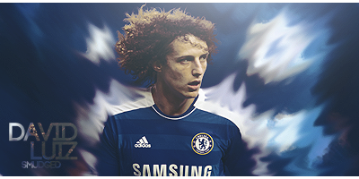
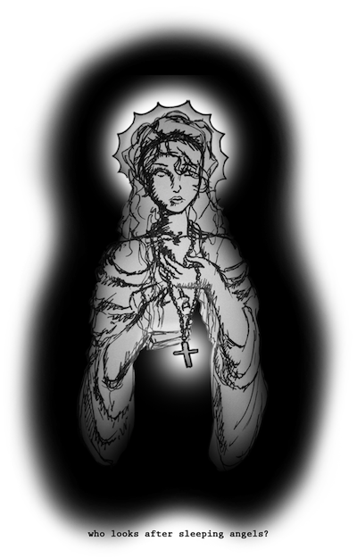
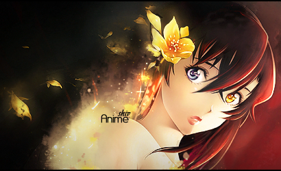
    Hello, today I tried making a signature with some smudging.
    Because I'm quite new to photoshop I had trouble smudging in the direction I wanted to, and I encountered some kind of invisible wall wich kept me from smudging to the left. Anyways, this is the result:

    Advice and criticism are more then welcome.

  2. #2

    Default

    Most important tip I'll give you is don't upload as a JPEG because they lose image quality. Upload as a PNG next time.

  3. #3
    Join Date
    Jan 2010
    Location
    Guatemala
    Posts
    1,084

    Default

    Quote Originally Posted by ColorBliind View Post
    Most important tip I'll give you is don't upload as a JPEG because they lose image quality. Upload as a PNG next time.
    i ALWAYS upload as JPEG o.o and i have good quality and btw nice sig quite amazing since your a begginer
    Favorite and Most Recent:


  4. #4

    Default

    Quote Originally Posted by chonfat View Post
    i ALWAYS upload as JPEG o.o and i have good quality and btw nice sig quite amazing since your a begginer
    Nevertheless, they lose image quality.

  5. #5
    Join Date
    Sep 2009
    Location
    Candy Mountain
    Posts
    832

    Default

    smudge wall: the thing that messes me up the most is when i accidentally select part of a picture without realizing it, i'll be in the middle of a line and all of the sudden i'll literally not be able to draw in another part of the picture. thats the only thing i can think of that would make it do something like that =\ idk otherwise

    looks pretty good ^.^

  6. #6
    Join Date
    Sep 2009
    Location
    New Jersey
    Posts
    4,752

    Default

    I was orignally using Jpegs but i switched to Pngs
    As for the sig it looks a bit to sharp
    i hate that black space to the left
    Text is nice though
    Keep at it


  7. #7
    Join Date
    Aug 2009
    Posts
    177

    Default

    I dont like the text and coloring


    MY DA IS HERE
    www.z4hr4dk4r.deviantart.com

    THX


  8. #8
    Join Date
    Jan 2009
    Location
    The netherlands
    Posts
    378

    Default

    its quite good considering your new to photoshop,
    as for formats, i think .png is the best format to save images with.


  9. #9
    Join Date
    Dec 2009
    Location
    Netherlands
    Posts
    1,412

    Default

    Quote Originally Posted by shiv96 View Post
    i hate that black space to the left
    That's the result of my smudge tool refusing to go to the left.
    Thanks for the feedback everyone!

Similar Threads

  1. Scarecrow
    By funn in forum Sigs & Manips
    Replies: 9
    Last Post: 10-24-2009, 11:38 PM
  2. ScareCrow
    By SparryGfx in forum Sigs & Manips
    Replies: 1
    Last Post: 09-22-2009, 09:35 AM
  3. scarecrow tag
    By +s9.Oath in forum Sigs & Manips
    Replies: 1
    Last Post: 09-18-2009, 10:18 PM
  4. Scarecrow.
    By w00teR in forum Sigs & Manips
    Replies: 2
    Last Post: 09-13-2009, 07:19 AM
  5. Scarecrow
    By Umbee in forum Sigs & Manips
    Replies: 3
    Last Post: 12-23-2005, 05:22 PM

Posting Permissions

  • You may not post new threads
  • You may not post replies
  • You may not post attachments
  • You may not edit your posts
  •  
Powered by vBadvanced CMPS v4.1.1