0 members and 3,340 guests
No Members online

» Site Navigation

» Stats
Members: 35,442
Threads: 103,075
Posts: 826,688
Top Poster: cc.RadillacVIII (7,429)
|
-
 Cuzns work Cuzns work
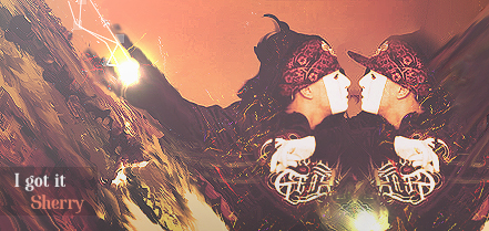
This is just some of my cousins work and I just felt like posting it lol but yeah i think they're realllyyy good.


My Three Rules Of Making a Sig Flow, Lighting and Depth
-
The lighting on the girl one is really really off, looks like he took a soft brush and just went over where he/she thought it should be
-
i disagree with donut... the only lighting thats off is possibly the blue lighting, it would technically reflect off her hair, but thats it... it looks great... kudos to ur cuz
-
I like the eye one
I don't think the lighting is off either donut
It looks good that way. Its kinda reflecting of her face so it looks cool
-
donut is right, look at the hair where it is green...is the green really suppose to be that bright? if so, the whole piece is messed up, get rid of the green where the hair is, plus make the face less green (bring more LIGHT instead of GLOW), and put more of a blue glow in the shadows of the bottom of her hair
In all deepest reality, we may only imagine the days past us, knowing that anything and all happens; and time will never be written until the happening... The future is 'eXcellence'.
eXx
-
looks pretty cool the eye is poorly cut though
-
-
Hmm. The third image looks very suspicious, I know I've seen it from somewhere. Did you use a tutorial for the third one?
Favorite

-
Yeah i think he used a tut for the third one.
My Three Rules Of Making a Sig Flow, Lighting and Depth
-
nice soft brushes work at 3rd image, i disagree with donut.
the lighting i think is trying to be at its great position but he could have lowered opacity.
tell your cousin just keep this pace up! 
Similar Threads
-
By Hell.Pro in forum Digital Art
Replies: 4
Last Post: 08-27-2005, 01:46 PM
-
By Pop-Up in forum Digital Art
Replies: 6
Last Post: 06-16-2005, 02:40 PM
-
By Gladiak in forum Digital Art
Replies: 5
Last Post: 06-15-2005, 01:11 PM
-
By PP Bone in forum Digital Art
Replies: 6
Last Post: 06-15-2005, 02:10 AM
-
By Volcom in forum Digital Art
Replies: 4
Last Post: 06-14-2005, 03:52 PM
 Posting Permissions
- You may not post new threads
- You may not post replies
- You may not post attachments
- You may not edit your posts
-
Forum Rules
|


 Reply With Quote