0 members and 1,933 guests
No Members online

» Site Navigation

» Stats

Members: 35,442
Threads: 103,075
Posts: 826,688
Top Poster: cc.RadillacVIII (7,429)
|
-
 Archer Archer
Hey,
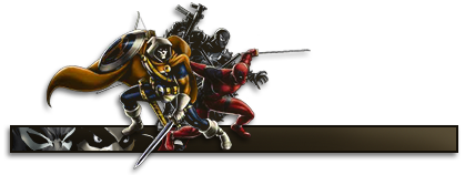
I'm bad at photoshop, but I made finally a sig again, and I thought showing it might be helpful if others tell me what to do differently.
This was also my first signature, WITHOUT following a tutorial, so yeah... Uhm If you've seen my older work which sucked more, you would know this is to me some improvement.
Cnc Please.

-

ok, since this is your first signature without following a tut, I am gonna say good job and it has some good things and some bad things about it. First the good things, you have pretty decent composition, with most of the action contained and placed well. Also the border and colors are interesting. For the bad things the focal point of the guys face and bow are a bit messy, the c4d's need to be erased a lil over the main focal points. The sig's theme is about an archer, but it looks like the bow is covered up or just not there, is there a bow in the render originally? The effects are ok, but could use a lil more clarity of the effects they look out of focus and distant. The text is not the best font and color, but the placement is ok, just brighten it up a lil its hard to see. Good stuff tho, kiu and keep experimenting without tutorials.
-

 Originally Posted by DOMINO

ok, since this is your first signature without following a tut, I am gonna say good job and it has some good things and some bad things about it. First the good things, you have pretty decent composition, with most of the action contained and placed well. Also the border and colors are interesting. For the bad things the focal point of the guys face and bow are a bit messy, the c4d's need to be erased a lil over the main focal points. The sig's theme is about an archer, but it looks like the bow is covered up or just not there, is there a bow in the render originally? The effects are ok, but could use a lil more clarity of the effects they look out of focus and distant. The text is not the best font and color, but the placement is ok, just brighten it up a lil its hard to see. Good stuff tho, kiu and keep experimenting without tutorials.
Thx dude, I see what you mean. I need to download some more fonts to get started anyway, I got none extra downloaded.
Uh Yeah the bow was a problem I couldn't get it right and later when I wanted to repair it, it seemed impossible.
The bow was there, but very very messy.
Thanks anyway.
Btw: I placed it accidentally in wrong section, I don't know why I did that? If it's possible to move, then thanks.
-

Your thread has been moved to the right section 
-

 Originally Posted by RadillacVIII

Your thread has been moved to the right section 
Thanks.
Similar Threads
-
By Renz in forum Sigs & Manips
Replies: 7
Last Post: 02-26-2010, 03:55 AM
-
By [PHXN] New001 in forum Sigs & Manips
Replies: 6
Last Post: 02-15-2007, 04:00 PM
-
By dgentz in forum Sigs & Manips
Replies: 1
Last Post: 10-11-2005, 02:50 AM
 Posting Permissions
- You may not post new threads
- You may not post replies
- You may not post attachments
- You may not edit your posts
-
Forum Rules
|


 Reply With Quote


