0 members and 381 guests
No Members online

» Site Navigation

» Stats

Members: 35,442
Threads: 103,075
Posts: 826,688
Top Poster: cc.RadillacVIII (7,429)
|
-
 Lineage 2 Lineage 2
-

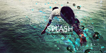
too much text
the blue is kinda odd looking
-


Challenges:
Posts: 100, 250, 500, 1,000, 2,000
SOTW Wins: 1, 2, 3
-

The small text should go, and you shouldn't put text in the corner takes away from the focal, I think if you added some blue in the foreground it would look better.
Blew the whole shit up on some, "What this button do?"
-

Too much text. Don't make the text overwhelm the focal. I do like your assortment of colors and the way how you used the effects. The composition, excluding the text is fine. Keep at it!
 Originally Posted by Slave
takken, you sweet boy you, i could eat you 6^
-
-

It's coming up now but I can't hardly read the text nevermind too much of it.
some nice effects, i like the 'wind' effect.
kiu

Challenges:
Posts: 100, 250, 500, 1,000, 2,000
SOTW Wins: 1, 2, 3
Similar Threads
-
By jice21 in forum Signature Tutorials
Replies: 4
Last Post: 09-10-2009, 04:43 PM
-
By Nonpro in forum Sigs & Manips
Replies: 7
Last Post: 12-04-2008, 03:43 AM
-
By DeadlyShadow in forum Sigs & Manips
Replies: 3
Last Post: 08-16-2008, 04:02 PM
-
By imported_Devil in forum Digital Art
Replies: 3
Last Post: 11-27-2005, 03:32 PM
-
By Proflax in forum The Void
Replies: 6
Last Post: 10-02-2005, 03:41 AM
 Posting Permissions
- You may not post new threads
- You may not post replies
- You may not post attachments
- You may not edit your posts
-
Forum Rules
|

