0 members and 372 guests
No Members online

» Site Navigation

» Stats

Members: 35,442
Threads: 103,075
Posts: 826,688
Top Poster: cc.RadillacVIII (7,429)
|
-
 Soaring through paradise Soaring through paradise
Blew the whole shit up on some, "What this button do?"
-

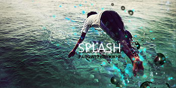
Nice texture but I think depth is needed. I'm not loving the focal but I am liking the underwater effect.
good work, kiu

Challenges:
Posts: 100, 250, 500, 1,000, 2,000
SOTW Wins: 1, 2, 3
-

cant really see what the render is and it looks LQ :S
-

I see what you were going for here but the execution was poor and overdone. Remember one of the most important things in a sig is the clear definition of a focal. I can't really discern the focal. Also the sig is too messy. Not clean at all. The texture would be better if you didn't over do it so much. The color scheme is too dull and provides no vibrancy or contrast. Sig needs cleaning. Work on composition. Keep at it!
 Originally Posted by Slave
takken, you sweet boy you, i could eat you 6^
Similar Threads
-
By cC.Dispeller in forum Sigs & Manips
Replies: 2
Last Post: 12-27-2009, 06:33 AM
-
By Dron in forum Sigs & Manips
Replies: 4
Last Post: 12-15-2009, 11:24 AM
-
By crazyspoonkiller in forum Digital Art
Replies: 4
Last Post: 10-02-2005, 07:03 PM
-
By Anarchy in forum Sigs & Manips
Replies: 4
Last Post: 08-10-2005, 12:42 PM
 Posting Permissions
- You may not post new threads
- You may not post replies
- You may not post attachments
- You may not edit your posts
-
Forum Rules
|

