0 members and 391 guests
No Members online

» Site Navigation

» Stats
Members: 35,442
Threads: 103,075
Posts: 826,688
Top Poster: cc.RadillacVIII (7,429)
|
-
 carrrrrrr carrrrrrr
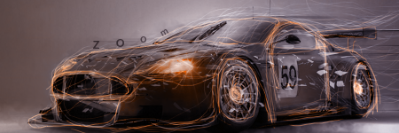
idk i guess its ok
not taken from mariomans tutuorial 
-
Wow I like it a lot.
Text is very nice.
Only thing is, add a border.
Also, how did you do that?
The effects on the car?
-
Looks pretty nice, i know where your trying to go with this but i seems incomplete.. maybe some c4d's trialing behind it would help add some flow and some more likes thicker and smaller will work out
Keep trying its looking good 
-
really really really really light smudging and the whole not from mariomans tut is sarcastic
-
Ohh, lol that must have taken for ever then.
-
i do enjoy spending time on my tags
i usually make sloppy tags for battles etc, but if i have time ill use it wisely
-
Yea if you have time you should put a good effort into your work because it shows
-
Nice stroking there. I really like the messy, yet consistent look you did the edges of the interior design of the model. I would brighten it up the color a bit though, and maybe even vary some of the strokes, but not too noticeably. The BG lacks though so its inconsisntent in that department. Try adding in some minor elements to fill it up but I really like the focal. Keep at it!
 Originally Posted by Slave
takken, you sweet boy you, i could eat you 6^
-
YOU STOLE MY IDEA!!! LIAR jk 
nice but i dont really like the text and it seems a little messy.
KIU
-
Originally Posted by Don!Lusive

Looks pretty nice, i know where your trying to go with this but i seems incomplete.. maybe some c4d's trialing behind it would help add some flow and some more likes thicker and smaller will work out
Keep trying its looking good
I agree with don!lusive here, but it looks awesome mate.
good work

Challenges:
Posts: 100, 250, 500, 1,000, 2,000
SOTW Wins: 1, 2, 3
 Posting Permissions
- You may not post new threads
- You may not post replies
- You may not post attachments
- You may not edit your posts
-
Forum Rules
|


 Reply With Quote