0 members and 14,317 guests
No Members online

» Site Navigation

» Stats
Members: 35,442
Threads: 103,075
Posts: 826,688
Top Poster: cc.RadillacVIII (7,429)
|
-
 Friday Friday
Last edited by Maietrix; 07-02-2010 at 08:00 PM.
Blew the whole shit up on some, "What this button do?"
-
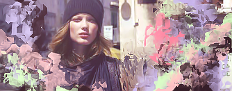
Colors dont really compliment each other, they come out looking bland imo. B&W is better, Okay flow, okay depth. kiu!
-
Dude, until you fix that blending I'mma copypasta my previous advice. Seriously, your blending needs work on. You generally color schemes are good but the composition and elements need better blending. They look too abrupt right now and its becoming more chaotic. The style needs more work on. Work on your composition. Keep at it!
 Originally Posted by Slave
takken, you sweet boy you, i could eat you 6^
-
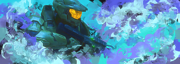
Halo one would be best there if they were different colours.
Also, version one of the top sig instead of version 2 simply because of the colours.
Also they always seem quite sharpened, tone it down a notch.
keep up the work man.

Challenges:
Posts: 100, 250, 500, 1,000, 2,000
SOTW Wins: 1, 2, 3
Similar Threads
-
By robgasm in forum Digital Art
Replies: 3
Last Post: 02-17-2008, 09:16 AM
-
By Horus in forum The Void
Replies: 25
Last Post: 10-18-2006, 10:32 AM
-
By tacoX in forum The Void
Replies: 17
Last Post: 12-02-2005, 10:03 PM
-
By tacoX in forum The Void
Replies: 10
Last Post: 07-27-2005, 09:58 AM
-
By demo in forum The Void
Replies: 6
Last Post: 01-18-2005, 07:44 PM
 Posting Permissions
- You may not post new threads
- You may not post replies
- You may not post attachments
- You may not edit your posts
-
Forum Rules
|


 Reply With Quote


