0 members and 1,973 guests
No Members online

» Site Navigation

» Stats
Members: 35,442
Threads: 103,075
Posts: 826,688
Top Poster: cc.RadillacVIII (7,429)
|
-
-

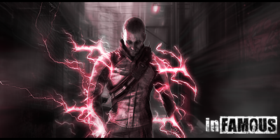
I like the sense of depth I have of this sig. Nice blur though i would have liked to see more intense colors in it. I think the focal stands out rather nicely though I disagree with the text positioning. Try adding extra elements in the BG, like a texture. Keep at it!
 Originally Posted by Slave
takken, you sweet boy you, i could eat you 6^
-
I agree with takken about the text placement. ^^
Also I would like to say I love this sig but the effect to the right, It doesn't suit properly imo;
It just suddenly comes from no where.
I love the effects overall just that one piece.
kiu

Challenges:
Posts: 100, 250, 500, 1,000, 2,000
SOTW Wins: 1, 2, 3
-
Originally Posted by Takken

I like the sense of depth I have of this sig. Nice blur though i would have liked to see more intense colors in it. I think the focal stands out rather nicely though I disagree with the text positioning. Try adding extra elements in the BG, like a texture. Keep at it!
kk thx takken 
Originally Posted by bcfcant
I agree with takken about the text placement. ^^
Also I would like to say I love this sig but the effect to the right, It doesn't suit properly imo;
It just suddenly comes from no where.
I love the effects overall just that one piece.
kiu
kk thx bro
More CnC please!!!
Favorite and Most Recent :

-
Yeah, as what most have suggested, remove the text.
Also, the tag is too dark and monotone for my liking (Add more colors! G- map comes in handy for stuff like this). However, that's just my preferences.
I like your use of effects, and how the subject is mainly in focal point.
Good job.

Ugh your signature is way too Micheal Bay'd
Visit my DeviantArt for more.
-
-
Originally Posted by Takken
I like the sense of depth I have of this sig. Nice blur though i would have liked to see more intense colors in it. I think the focal stands out rather nicely though I disagree with the text positioning. Try adding extra elements in the BG, like a texture. Keep at it!
I agree. Everything is sweet but I would like to see some vivid colors. I like that you added the logo but it could be done it a more interesting way...
-
kk thx man more CnC please
Favorite and Most Recent :
-
Love the Fx
Great Depth
Just work on colors

-
Similar Threads
-
By marioman77 in forum Sigs & Manips
Replies: 7
Last Post: 06-19-2010, 08:07 PM
-
By schultz in forum Sigs & Manips
Replies: 1
Last Post: 02-28-2010, 04:21 AM
-
By Chidori. in forum Sigs & Manips
Replies: 13
Last Post: 06-16-2009, 12:54 AM
-
By DanielGFX in forum Sigs & Manips
Replies: 3
Last Post: 06-06-2009, 01:45 PM
-
By cC.ShorterGFX in forum Sigs & Manips
Replies: 3
Last Post: 06-01-2009, 09:59 AM
 Posting Permissions
- You may not post new threads
- You may not post replies
- You may not post attachments
- You may not edit your posts
-
Forum Rules
|


 Reply With Quote


