0 members and 26,370 guests
No Members online

» Site Navigation

» Stats
Members: 35,442
Threads: 103,075
Posts: 826,688
Top Poster: cc.RadillacVIII (7,429)
|
-
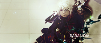
 Paranoia Paranoia
My latest sig:
v1:text
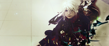
v2:no text
Don't really like this one myself but eh, cnc?

Challenges:
Posts: 100, 250, 500, 1,000, 2,000
SOTW Wins: 1, 2, 3
-
I prefer version 1 because the white text balances out the color due to the subject's white hair.
I think the green/ teal c4d at the bottom right corner is a little unfitting, and it would look better without it or recolored.
One part of the c4d behind the character is wayy too sharp. I suggest you to blur it to give it a bit of depth.
Overall, its not bad, and I like the use of lighting.
Well done, and keep it up.

Ugh your signature is way too Micheal Bay'd
Visit my DeviantArt for more.
-
Thanks alot mate, I wasn't going to add it the c4d but it lacked effects lol;
I personally don't like the right hand side, I over burned it :P
Challenges:
Posts: 100, 250, 500, 1,000, 2,000
SOTW Wins: 1, 2, 3
-
 Originally Posted by bcfcant

Thanks alot mate, I wasn't going to add it the c4d but it lacked effects lol;
I personally don't like the right hand side, I over burned it :P
Haha, it isn't really necessary to use a c4d in every tag. Imo, most of the time a tag would look better without it. Though, it depends on the way the person utilizes it. I think that the easier the effect is conveyed towards the audience, the better.
An idea: You could try using a splatter effect(Splatter brush) and place it at the bottom of the subject, and use clipping mask with the background (floor) with the brush splatter to create an effect where the subject crashed onto the floor and mini particles are flying out.
Well, that's just an idea, you don't really have to take it into account.
Last edited by Fayfie; 07-03-2010 at 07:45 AM.
Ugh your signature is way too Micheal Bay'd
Visit my DeviantArt for more.
-
The elements behind are overcontrasted. Also there is a wide space to the left in which you can incorporate more elements. The color scheme isn't too good and the lighting is poor. Use more elements and spread them out intelligently across the composition, once it fits. Keep at it!
Originally Posted by Slave
takken, you sweet boy you, i could eat you 6^
-
Fx are Dark
Very Wide
I like the lighting but work on the compo
Colors could be better
Keep at it mate

-
no text
awkward lighting too bright
-
Lack of balance. There needs to be a little more in the background. I feel like I get lost in the C4Ds but I think I get the effect you were going for, and it was a good attempt.
-
thanks guys, I'm just going to scrap this one,
fayfie, awesome idea there! :O
Challenges:
Posts: 100, 250, 500, 1,000, 2,000
SOTW Wins: 1, 2, 3
Similar Threads
-
By cC.Lee in forum Sigs & Manips
Replies: 8
Last Post: 05-04-2010, 07:27 PM
-
By spydannja in forum Sigs & Manips
Replies: 4
Last Post: 05-10-2009, 02:19 AM
-
By Studhorse in forum Sigs & Manips
Replies: 1
Last Post: 07-24-2008, 12:31 PM
-
By MartinBabies in forum The Void
Replies: 5
Last Post: 04-18-2005, 10:47 AM
 Posting Permissions
- You may not post new threads
- You may not post replies
- You may not post attachments
- You may not edit your posts
-
Forum Rules
|


 Reply With Quote


