0 members and 26,370 guests
No Members online

» Site Navigation

» Stats
Members: 35,442
Threads: 103,075
Posts: 826,688
Top Poster: cc.RadillacVIII (7,429)
|
-
 spiderman spiderman
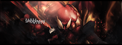
w/o text
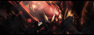
CnC and all that good stuff, also which do you prefer 
Last edited by Glockoma; 07-08-2010 at 11:13 AM.
-
second version is better although you are showing improvement on your text mate,
some nice flow and effects in this one, kiu mate!

Challenges:
Posts: 100, 250, 500, 1,000, 2,000
SOTW Wins: 1, 2, 3
-
 Originally Posted by bcfcant

second version is better although you are showing improvement on your text mate,
some nice flow and effects in this one, kiu mate!
Thanks very much man! 
-
Seems a tad bit overcontrasted in the left corner, also I'm not really diggin' the motion blur. The flow is too forced. I like the compo in the right corner but its lacking in terms of elements and the lighting needs more work on. Work on your color scheme and lighting. Keep at it!
Originally Posted by Slave
takken, you sweet boy you, i could eat you 6^
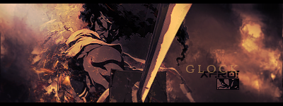
Similar Threads
-
By Breäkdown in forum Sigs & Manips
Replies: 4
Last Post: 11-23-2008, 08:52 AM
-
By BigPete7978 in forum Sigs & Manips
Replies: 2
Last Post: 11-06-2008, 11:37 PM
-
By Garis in forum Sigs & Manips
Replies: 13
Last Post: 10-19-2008, 05:15 AM
-
By cc.mio in forum Sigs & Manips
Replies: 2
Last Post: 10-16-2008, 12:46 PM
-
By Grady in forum Digital Art
Replies: 9
Last Post: 02-01-2006, 11:33 PM
 Posting Permissions
- You may not post new threads
- You may not post replies
- You may not post attachments
- You may not edit your posts
-
Forum Rules
|


 Reply With Quote

