0 members and 2,918 guests
No Members online

» Site Navigation

» Stats

Members: 35,442
Threads: 103,075
Posts: 826,688
Top Poster: cc.RadillacVIII (7,429)
|
-
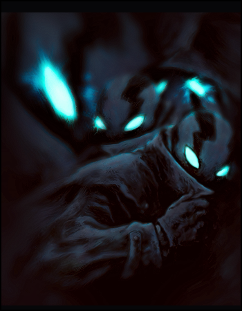
 My astro for Don ^) My astro for Don ^)
What u think guys? i try something new..
Club Claro Member Signature (made by myself):

My last signature:

Gift from Radillac:

-

thats amazing you should make a tut it would be much appreciated you should make a tut it would be much appreciated
-

so many color correction layers...so hard to make tut
Club Claro Member Signature (made by myself):

My last signature:

Gift from Radillac:

-

 v2 i think its better.Add more light on face and another clean v2 i think its better.Add more light on face and another clean
Club Claro Member Signature (made by myself):

My last signature:

Gift from Radillac:

-

yo dispeller you got some nice c4ds... i think you should share in the team fcuk !t resource thread
-

yeah, you should share it! xD
nice tag btw! love the topaz and the depth
I dont make sigs anymore
-

The lighting is a bit weak mate. I think the bubble effects, the orange circles or w.e they are too contrasted and need to be lighter. I think the overall blending is good though I think it needs more minimal elements to the left side. Oh yeah, the text needs to go. Its too bunched to the right right now. Nice one mate. You had me like "wtf, o.O" when I first looked at it lol.
Last edited by Takken; 07-10-2010 at 03:05 PM.
 Originally Posted by Slave
takken, you sweet boy you, i could eat you 6^
-

 Originally Posted by Takken

The lighting is a bit weak mate. I think the bubble effects, the orange circles or w.e they are too contrasted and need to be lighter. I think the overall blending is good though I think it needs more minimal elements to the left side. Oh yeah, the text needs to go. Its too bunched to the right right now. Nice one mate. You had me like "wtf, o.O" when I first looked at it lol.
I disagree about the lighting, it's subtle but there's a clear source and it's something different from the usual 200px softbrush you see all the time. I agree the left is a bit empty tho...perhaps some subtle effects.
-

 Originally Posted by Aether

I disagree about the lighting, it's subtle but there's a clear source and it's something different from the usual 200px softbrush you see all the time. I agree the left is a bit empty tho...perhaps some subtle effects.
The thing is Aether, it sort of looks like IMO thats what he did lol. No offense Dispel.
 Originally Posted by Slave
takken, you sweet boy you, i could eat you 6^
-

honestly it is a over bit sharpened but its really creative and if you added more flow and it would be an amazing piece!
There are none so blind as those that will not see.

Similar Threads
-
By Aurrum in forum The Void
Replies: 2
Last Post: 10-31-2009, 08:50 PM
 Posting Permissions
- You may not post new threads
- You may not post replies
- You may not post attachments
- You may not edit your posts
-
Forum Rules
|

