0 members and 1,990 guests
No Members online

» Site Navigation

» Stats
Members: 35,442
Threads: 103,075
Posts: 826,688
Top Poster: cc.RadillacVIII (7,429)
|
-
 the force the force
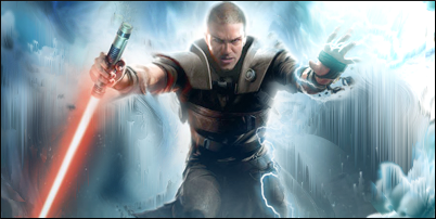
text looked terrible in it... rate it and tell me anything i need to improve
thanks
-
really nice work but where is the light source, behind or top right?, the top right seems really bright aswell, kiu though mate.

Challenges:
Posts: 100, 250, 500, 1,000, 2,000
SOTW Wins: 1, 2, 3
-
i kind of made it behind him and his hand... LIGHTNING BOLT LIGHTNING BOLT!lol thanks.
anyone else?
-
Don't center your focal, it makes me rage. Also try to blend the render a bit more imo.
-
 Originally Posted by Aether

Don't center your focal, it makes me rage. Also try to blend the render a bit more imo.
However, if you think about it, the focal would look odd if it was placed on one of the intercepting lines in the rule of thirds.
@topic: I think it would look better if you made the height of the canvas smaller (Mid shot) and add contrast to it, plus sharpening the focal points in the piece.

Ugh your signature is way too Micheal Bay'd
Visit my DeviantArt for more.
-
Originally Posted by Fayfie
However, if you think about it, the focal would look odd if it was placed on one of the intercepting lines in the rule of thirds.
@topic: I think it would look better if you made the height of the canvas smaller (Mid shot) and add contrast to it, plus sharpening the focal points in the piece.
i jujst wanted to get the main part of the stock in it.. and i dont think it would look good at the side:P
-
Originally Posted by xSattisfaCtioNz
i jujst wanted to get the main part of the stock in it.. and i dont think it would look good at the side:P
Haha, yeah. Due to the width and the pose of the character/ render.
Anyway, I think it would be sick if you made the height around 150px, added contrast and took away the borders.
I'd give you an example, but its against the rules to do so. x_x
Ugh your signature is way too Micheal Bay'd
Visit my DeviantArt for more.
-
Originally Posted by Fayfie
Haha, yeah. Due to the width and the pose of the character/ render.
Anyway, I think it would be sick if you made the height around 150px, added contrast and took away the borders.
I'd give you an example, but its against the rules to do so. x_x
against the rules to do what?:O
-
Originally Posted by xSattisfaCtioNz
against the rules to do what?:O
Editing signatures or posting other people's work without permission.
Ugh your signature is way too Micheal Bay'd
Visit my DeviantArt for more.
-
Interesting BG but the clouds or w.e they are to the right lacks blending and the color schme needs extra tones. The lighting is a bit shoddy and it has a lack of contrast. Try more minimal elements to pinpout in the foreground to help the space around the focal. keep at it!
Originally Posted by Slave
takken, you sweet boy you, i could eat you 6^
Similar Threads
-
By Renz in forum Sigs & Manips
Replies: 7
Last Post: 02-26-2010, 03:55 AM
-
By s0ggywaffls in forum Sigs & Manips
Replies: 4
Last Post: 12-30-2007, 09:33 AM
-
By Dutch-Soldier(nl) in forum Sigs & Manips
Replies: 2
Last Post: 11-08-2005, 08:06 PM
-
By Dick in forum Sigs & Manips
Replies: 6
Last Post: 11-07-2005, 04:30 PM
-
By Umbee in forum Sigs & Manips
Replies: 3
Last Post: 11-06-2005, 03:27 PM
 Posting Permissions
- You may not post new threads
- You may not post replies
- You may not post attachments
- You may not edit your posts
-
Forum Rules
|


 Reply With Quote


