0 members and 1,709 guests
No Members online

» Site Navigation

» Stats

Members: 35,442
Threads: 103,075
Posts: 826,688
Top Poster: cc.RadillacVIII (7,429)
|
-
 Star War ;D Star War ;D
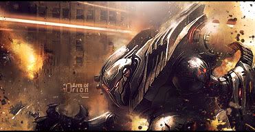
Ah, well I worked on a lil' something for a while.
I think this is the longest time I have spent on a signature.
I messed up a lot though :O
Had to redo a couple of things.
My final outcome though:

I'm proud of the outcome.
CnC?
Edit: Oooh. Title failure it's suppose to be, "Star Wars"
Last edited by Derosion; 07-24-2010 at 05:27 PM.
-

The smudging is awesome, is that with a normal chalk brush and splatter settings? looks great.
Normally I would say simple black or white borders are the best but I actually like that border its nice and subtle and it goes with the overlay shapes you've got going on in the bg.
Only got two points to pick up on really. 1 try and keep the renders face or whatever you want to be the focal point clean from smudging and other effects and 2 try and place your render off center slightly it draws more attention to it than if you place it dead center.
But it's a cool sig, I love the smudging and effects in the bg.
Fav:

Latest:

-

Thank you and I totally agree with your criticism.
I think I raised scattering a bit when I tried to blend in the render, so it went over it a bit.
I totally regret doing it, but I just don't want to re-add it, too lazy (:
Funny thing, because before my render was more to the left but then I said .. people are going to say "WEAK FOCAL" so I moved it over a little bit.
It's not perfectly centered though, it's still more to the left ;D.
Btw. I got this idea for this signature from your work's. I really like them so I though i'd give a shot.
-

 Originally Posted by Mega

I think I raised scattering a bit when I tried to blend in the render, so it went over it a bit.
I totally regret doing it, but I just don't want to re-add it, too lazy (:
Haha I know the feeling it's much easier just to make sure it doesn't happen in the next sig than fix it in the current one :P
 Originally Posted by Mega

Btw. I got this idea for this signature from your work's. I really like them so I though i'd give a shot.
Really? Wow I feel honoured I'm glad you like my work, keep up the awesome sig making dude.
Fav:

Latest:

-

It's really easy to over-blend when you're getting the hang of blending, which you clearly did here. This is a really good sig, don't get me wrong, but the focal point gets lost in all the smudging and blending. Good work though. I can't wait to see more.
Similar Threads
-
By lahabz in forum Sigs & Manips
Replies: 2
Last Post: 01-27-2010, 10:05 PM
-
By jeebin in forum Sigs & Manips
Replies: 8
Last Post: 12-29-2006, 07:15 PM
-
By Maggie in forum Digital Art
Replies: 2
Last Post: 12-03-2005, 12:36 AM
-
By Em][n3m in forum Digital Art
Replies: 3
Last Post: 07-02-2005, 08:27 PM
-
By Oblivion in forum Digital Art
Replies: 10
Last Post: 06-21-2005, 08:18 PM
 Posting Permissions
- You may not post new threads
- You may not post replies
- You may not post attachments
- You may not edit your posts
-
Forum Rules
|


 Reply With Quote


