0 members and 6,636 guests
No Members online

» Site Navigation

» Stats
Members: 35,442
Threads: 103,075
Posts: 826,688
Top Poster: cc.RadillacVIII (7,429)
|
-
-

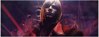
Actually it's not all that bad. The lighting is on key effects are decent but could be improved on. Only nitpick is the text other than that keep it up.

My Three Rules Of Making a Sig Flow, Lighting and Depth
-
Your lighting is better than mine by a long shot. This definitely sets a mood.

 = Monroe Smith IV = Monroe Smith IV
 = skeetonbeezies = skeetonbeezies
-
-
As a general tip for text, don't leave it plain old horizontally. Work it in with the flow of your piece. At least I find that almost always helps a tag out.
Pretty good, like the colors, like the effects, good lighting, maybe do a little more with it though, maybe a texture or something for the bg, the top left part in particular feels kind of flat.


SOMETIMES I LIKE TO CREATE THINGS
-
 Originally Posted by Vicious Zen

As a general tip for text, don't leave it plain old horizontally. Work it in with the flow of your piece. At least I find that almost always helps a tag out.
Pretty good, like the colors, like the effects, good lighting, maybe do a little more with it though, maybe a texture or something for the bg, the top left part in particular feels kind of flat.
I think the text generally fits the mood of the game,the sig,and the font if he changed it it would look like just a GFX signature with a render thrown on top of it.
-
It's a pretty good sig actually.
My only problem with it really is that there seems to be a lack of things going on in the foreground.
Other than that, I can't find a problem with as the background is interesting and your lighting is good.
Keep it up. 
-
the lighting isnt bad but its a bit strong. The effects are nice but dont stand out enough, make your effects pop more by sharpening them and using c4ds and other techniques.
The render looks like its maybe a bit oversharpened, im not sure though, but look into that. Also i think the render is to contrasting whilst the bg and effects arnt contrasting enough. You want your sig to really pop out at the view, this one is a bit dull. Use Adjustment layers to work with your brightness, contrast, and colors. I would suggest some selective color adjusts, and a b/w grad map set to luminosity.
for the text, i would "AND MEN" under and slightly to the right of "OF DEVILS"
kiu the work, hope this helps
-
It's good i really like it i think the colours and everything work really well, however i do agree the text isn't great..
-
Similar Threads
-
By Necrothalass in forum Sigs & Manips
Replies: 8
Last Post: 08-03-2010, 04:00 PM
-
By Kipi in forum Sigs & Manips
Replies: 1
Last Post: 12-23-2009, 03:46 AM
-
By KidBuu in forum Sigs & Manips
Replies: 4
Last Post: 01-03-2009, 11:27 AM
-
By AoD1315 in forum Sigs & Manips
Replies: 5
Last Post: 12-14-2005, 03:25 AM
-
By Elite Newb in forum The Void
Replies: 36
Last Post: 10-22-2005, 03:07 AM
 Posting Permissions
- You may not post new threads
- You may not post replies
- You may not post attachments
- You may not edit your posts
-
Forum Rules
|


 Reply With Quote


