0 members and 391 guests
No Members online

» Site Navigation

» Stats
Members: 35,442
Threads: 103,075
Posts: 826,688
Top Poster: cc.RadillacVIII (7,429)
|
-
 Archer Signature Archer Signature
I got bored, so I made this. 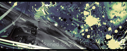
CnC Please.
-
I don't get it... Lol. The paint splatter brush is used twice right next to each other. The text is boring and there's no real focal point, lighting, or depth.
-
the colors are cool, but you ruined the scheme with the black and grey c4d in the middle.
I would suggest blurring a few locations and create yourself a focal point for people to be draw into.
-
archer sig? im a little confused on what i see right there
-
Favorite and Most Recent  :

-
Exactly what Kritez said. I like your effects, and colors here, but it's too chaotic (and coming from me, that's saying something, haha) Text is too pasted on, as well. Needs to be worked in a little better, with a style like this anyways.


SOMETIMES I LIKE TO CREATE THINGS
Similar Threads
-
By Seriously in forum Sigs & Manips
Replies: 4
Last Post: 05-31-2010, 11:18 AM
-
By Renz in forum Sigs & Manips
Replies: 7
Last Post: 02-26-2010, 03:55 AM
-
By DanielGFX in forum Sigs & Manips
Replies: 6
Last Post: 06-07-2009, 12:45 PM
-
By [PHXN] New001 in forum Sigs & Manips
Replies: 6
Last Post: 02-15-2007, 04:00 PM
-
By dgentz in forum Sigs & Manips
Replies: 1
Last Post: 10-11-2005, 02:50 AM
 Posting Permissions
- You may not post new threads
- You may not post replies
- You may not post attachments
- You may not edit your posts
-
Forum Rules
|


 Reply With Quote


