0 members and 511 guests
No Members online

» Site Navigation

» Stats
Members: 35,442
Threads: 103,075
Posts: 826,688
Top Poster: cc.RadillacVIII (7,429)
|
-
 Hellgate sign Hellgate sign
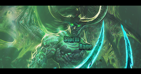
hellow, my first signature i show here in public, just made it yesterday. I'm quite noob in this, but i would like to know youre reactions. I was seaking after a render with nice flow and came up to a great one from hellgate, ok the render picks more than 2/3 of the canvas, but coulnt do a thing about it. Hopefully i havent distroyed the beauty of the render, so CnC are very welcome :p

-
Thats quite good, though a question ,what the hell is the blue and green thing, and why is it there? Oh and you mispealt zombies 
-
I like it, but that blue draws my attention away from the amazingness of the sig itself.
-
wth youre right, stopid of me  didnt know what to do with the text, so deletet it sometimes, probably thats why the mistake( or otherwise my english isnt that good) didnt know what to do with the text, so deletet it sometimes, probably thats why the mistake( or otherwise my english isnt that good)
And that blue thing i know when i used a random chosen effect c4d there appeared some smaller blue color, at first didnt like it, but afterwards it broke a bit the monotone colors so maked it a bit more visible, but ok isnt necerary...
-
-
As said above, you did get flow, and flow is rather important, and one of the two things i need to work on 
-
yes that blue/green ruins it and if u blurred the zombies it wouldbe better imo
-
its far to dark and dull, it needs better lighting. Make the lighting around your focal point.
Similar Threads
-
By zahradkar in forum Sigs & Manips
Replies: 4
Last Post: 02-01-2010, 03:40 PM
-
By dave9339 in forum Sigs & Manips
Replies: 6
Last Post: 04-15-2009, 10:04 AM
-
By .Moon.Man. in forum Sigs & Manips
Replies: 2
Last Post: 11-12-2008, 02:04 PM
-
By ratchetnclank in forum Sigs & Manips
Replies: 10
Last Post: 10-02-2008, 10:20 AM
-
By Pleymo in forum Sigs & Manips
Replies: 3
Last Post: 05-07-2006, 06:27 AM
 Posting Permissions
- You may not post new threads
- You may not post replies
- You may not post attachments
- You may not edit your posts
-
Forum Rules
|


 Reply With Quote