0 members and 389 guests
No Members online

» Site Navigation

» Stats
Members: 35,442
Threads: 103,075
Posts: 826,688
Top Poster: cc.RadillacVIII (7,429)
|
-
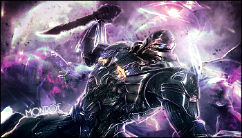
 Keepin busy.. Keepin busy..

 = Monroe Smith IV = Monroe Smith IV
 = skeetonbeezies = skeetonbeezies
-
i dont like the splatter that cover the whole focal.
erase the splatters from the body and right top corner imo
-
The splatter isn't really on the focal, except maybe his arm a bit.
= Monroe Smith IV
= skeetonbeezies
-
it looks like that tho :P
-
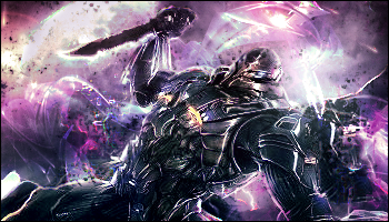
Here you go:
= Monroe Smith IV
= skeetonbeezies
-
Text position could be improved, and the background destroys the flow
-
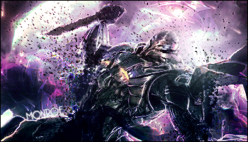
Thanks for the CnC. Another revision:
= Monroe Smith IV
= skeetonbeezies
-
looks alot less hectic  For some reason i don't like it, but i'm really not sure why For some reason i don't like it, but i'm really not sure why
-
i like the splatters and i thinkt he text is in an alright postion , just remove somew of them from its face , you removes too many on your v2 imo
v3 is nice too (:
-
O dear, Flatty again with his Long Cnc's, Hide!
When you place a render like this, there's a must of flow. Too be honest, there isn't much of a flow in it.
The bg draws all the attention because it's brighter as the focal, Try to avoid that.
The splatters could be used in a positive way, they were just placed incorrectly
KIU mate
WHAT'S THIS?! A SIGNATURE?
Similar Threads
-
By Demon4 in forum Sigs & Manips
Replies: 1
Last Post: 11-10-2009, 04:48 PM
-
By Adam in forum Sigs & Manips
Replies: 5
Last Post: 12-30-2005, 02:51 PM
 Posting Permissions
- You may not post new threads
- You may not post replies
- You may not post attachments
- You may not edit your posts
-
Forum Rules
|


 Reply With Quote


