0 members and 20,735 guests
No Members online

» Site Navigation

» Stats

Members: 35,442
Threads: 103,075
Posts: 826,688
Top Poster: cc.RadillacVIII (7,429)
|
-
-

I like V1 better, looks pretty sweet.
Good job
-

Lol I was thinking Gears Of War.
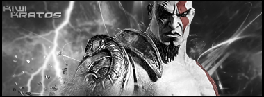
Anyways the flow is off to the right of his shoulder it seems as you tried to create a flow going off to the North East yet the left of him the thunder is going downwards. Also I'm feeling a monotonic vibe from this piece. Text is ill placed. You might want to try the rule of the thirds or place it closer to the focal.

My Three Rules Of Making a Sig Flow, Lighting and Depth
-

I like, I can't say too much against it  Sometimes always working in one direction gets annoying, why does everything have to move down stream ? >>< Sometimes always working in one direction gets annoying, why does everything have to move down stream ? >><
KIU looks jawsome <3 
 Radi's one of a kind gift <3
 ^My Wish List^

-

The render looks blurred/lq to me. The depth is nice, but it doesn't really have any flow.
-

There is no flow or even a sense of it.
Effects look too random, imo.
Seems a bit dull, but that's because of the render color, I guess.
More contrast, flow and stronger effects.
Kiu!
-

 Originally Posted by Mega

There is no flow or even a sense of it.
Effects look too random, imo.
Seems a bit dull, but that's because of the render color, I guess.
More contrast, flow and stronger effects.
Kiu!
this and text is out of place put it next to render
-

Bogui and Mega nailed it.
To add flow, just have your elements lining up, and playing off of each other, rather than just floating about so randomly.


SOMETIMES I LIKE TO CREATE THINGS
-

Well, as far as critisim is concerned i dont have anything to say that hasnt already been stated.
so emh...dont give in to peer pressure 
keep it up
-

I second everything everyone else said, kiu though.
 Posting Permissions
- You may not post new threads
- You may not post replies
- You may not post attachments
- You may not edit your posts
-
Forum Rules
|


