0 members and 393 guests
No Members online

» Site Navigation

» Stats

Members: 35,442
Threads: 103,075
Posts: 826,688
Top Poster: cc.RadillacVIII (7,429)
|
-
 Another sig - Ironman Another sig - Ironman
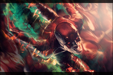
I decided to create a sig using an anime version of ironman (rendered by Domino):

-

To monotone imo. Not bad smudging, but there's no light source. Not bad though, just try adding in a little color.
-

Aye finally working on a bit of foreground. A bit plain more could be done
kiu.

My Three Rules Of Making a Sig Flow, Lighting and Depth
-
-

 Originally Posted by Doodle

To monotone imo. Not bad smudging, but there's no light source. Not bad though, just try adding in a little color.
^ I agree with this cnc, the lighting spots on the render will indicate where your light source should come from in this case its above center and to the right a little bit off canvas. Add that and it will help bring the focal out some. The character is Rocketman not Ironman tho. nice work tho I like the smudge stuff on the sides, the colors go perfect with the render. gj.
-

Blending could be better, and the depth is kinda weird. Not too bad though. Pretty clean.
-

That's Rocket Man, not Ironman. It's from an old movie.
As for the sig, the comic looking render doesn't fit with the smooth background. Way too monotone for me as well. You've just about got the blending down though. KIU.

 = Monroe Smith IV = Monroe Smith IV
 = skeetonbeezies = skeetonbeezies
Similar Threads
-
By Monroe in forum Sigs & Manips
Replies: 3
Last Post: 08-21-2010, 12:07 PM
-
By Xelo in forum Sigs & Manips
Replies: 11
Last Post: 10-29-2009, 11:38 AM
-
By funn in forum Sigs & Manips
Replies: 8
Last Post: 10-27-2009, 12:16 PM
-
By neospark in forum Sigs & Manips
Replies: 2
Last Post: 09-21-2009, 01:53 AM
-
By jorrne in forum Sigs & Manips
Replies: 2
Last Post: 09-19-2009, 09:37 PM
 Posting Permissions
- You may not post new threads
- You may not post replies
- You may not post attachments
- You may not edit your posts
-
Forum Rules
|


