0 members and 395 guests
No Members online

» Site Navigation

» Stats

Members: 35,442
Threads: 103,075
Posts: 826,688
Top Poster: cc.RadillacVIII (7,429)
|
-
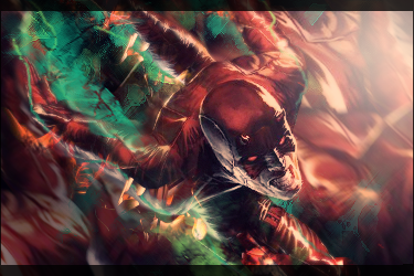
 Angel Angel

Renewed the last one. CnC
-

Better, but still fairly empty.
-

 Originally Posted by RunningMan

Better, but still fairly empty.
ahh.thanks. any suggestions in what can i add?
-

To me, a render is what makes or breaks a sig. You can do everything right (colors, depth, lighting, etc) but if the render isn't interesting, then who wants to look at it?
This would be an example of a boring render. Same goes for the sig under Favorite that you have. Both renders are boring, they have no action, no motion, nothing going on. You look at them real quick, think OK, and then move on. It's has nothing to do with your design skills, just the render themselves.

 = Monroe Smith IV = Monroe Smith IV
 = skeetonbeezies = skeetonbeezies
Similar Threads
-
By SaTe in forum Sigs & Manips
Replies: 1
Last Post: 09-10-2009, 05:47 AM
-
By Bloodshed in forum Sigs & Manips
Replies: 3
Last Post: 01-20-2009, 09:15 PM
-
By Papa in forum Digital Art
Replies: 11
Last Post: 05-16-2007, 08:11 PM
-
By uNi in forum Digital Art
Replies: 0
Last Post: 04-30-2006, 01:20 AM
-
By Ravon in forum Sigs & Manips
Replies: 5
Last Post: 02-11-2006, 07:55 PM
 Posting Permissions
- You may not post new threads
- You may not post replies
- You may not post attachments
- You may not edit your posts
-
Forum Rules
|

