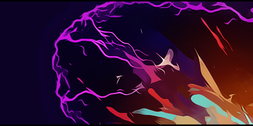
GFXVoid Graphic Design Forum

Remove Text Formatting
Loading...

» Online Users: 19,247

0 members and 19,247 guests
No Members online

» Site Navigation

 > FAQ

» Stats

Members: 35,442
Threads: 103,075
Posts: 826,688
Top Poster: cc.RadillacVIII (7,429)
Welcome to our newest member, Lekelindids
Results 1 to 5 of 5

Thread: Space - Heat

  1. #1
    Join Date
    Sep 2008
    Location
    Australia
    Posts
    2,310

    Default Space - Heat

    Decided to try out a bit of Space Art with what I've learnt over the few years. I've done a couple of minor images for more of a trial, but never tried a large scale image. There's still a long way to go before I'll make some better stuff, so if anyone can give me some tips or a few pointers, I'd love to hear your opinion.

    Time: 3 hours
    Equipment Used: Wacom Bamboo Tablet, PC Mouse
    Full size: 2000 pixels x 1000 pixels
    DA: Space - Heat by ~NuttsnBolts on deviantART


  2. #2
    Join Date
    Dec 2009
    Location
    Netherlands
    Posts
    1,412

    Default

    Is it my imagination or is there a stick figure drawn on the planet?
    Ah well I think it looks sick anyway, keep it up!

  3. #3
    Join Date
    Sep 2008
    Location
    Australia
    Posts
    2,310

  4. #4
    Join Date
    Sep 2008
    Posts
    1,589

    Default

    very nice mate.

    I like the space work a lot and the colours fit brill. Only thing id change is the sharpness of your planet texture its standing out a little to much.

    Great stuff better than I could have ever done.

  5. #5
    Join Date
    Mar 2007
    Location
    Denmark
    Posts
    4,197

    Default

    This looks pretty good Nutter, however i would have loved a bigger version, i have seen that the original size is big so why such a small preview?
    Okay here are some things i would like you to improve or atleast what i think can be improoved the stars its till look to much filter>noise like. Try doing more to them, one of the most maken mistakes in spaceart is the underestiment of a starfield. If the stars looks unreal the image itself tends to look so aswell. The starfield is to clustered together and you can see the places where you erased to get some flow into it and thats nice however you need to have some single stars and some cluster all in one so that it will seem realistic. sorry for my bad english havent used it for quite a while

    The nebula thing looks pretty good actually, maybe a bit more depth in it would be nice, im looking forward to seeing more drawn stuff from you

    Planet:
    Did you use only one texture here? It looks a little boring the texture that is i think the atmosphere looks pretty good and the lightning and shadow over the planet looks good too.

    Looking forward to seeing some more

Similar Threads

  1. Over Heat
    By Agato in forum Sigs & Manips
    Replies: 10
    Last Post: 09-06-2010, 04:29 PM
  2. Tekken Heat tut
    By tekken in forum Signature Tutorials
    Replies: 10
    Last Post: 04-19-2009, 08:20 AM
  3. Heat of Battle.....
    By Tooms in forum Sigs & Manips
    Replies: 4
    Last Post: 05-22-2008, 05:12 PM
  4. heat
    By phatso in forum Digital Art
    Replies: 3
    Last Post: 11-05-2005, 12:43 AM
  5. Heat
    By .element in forum Digital Art
    Replies: 4
    Last Post: 09-06-2005, 07:14 PM

Posting Permissions

  • You may not post new threads
  • You may not post replies
  • You may not post attachments
  • You may not edit your posts
  •  
Powered by vBadvanced CMPS v4.1.1