0 members and 3,580 guests
No Members online

» Site Navigation

» Stats
Members: 35,442
Threads: 103,075
Posts: 826,688
Top Poster: cc.RadillacVIII (7,429)
|
-
 ~> Shining . ~> Shining .
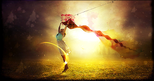
Some C4d effects and lighting .. 

B/W

hmm .. Cnc
~

-
it is very nicely done, very soft and lady like . Not so hot about the text, there is something in the corner says sub i think is that a watermark ? .. pardon me for sounding newb but I'm still new to tagging ^^ .. pardon me for sounding newb but I'm still new to tagging ^^
the c4d you used is placed well and follows the colours bravo ^^
KIU welcome to the void !!!
p.s if your into anime follow my link below to voids resource section an my render thread
/enjoy an hope to see more of you ^^
 Radi's one of a kind gift <3
 ^My Wish List^

-
 Originally Posted by Slave

it is very nicely done, very soft and lady like . Not so hot about the text, there is something in the corner says sub i think is that a watermark ? .. pardon me for sounding newb but I'm still new to tagging ^^
the c4d you used is placed well and follows the colours bravo ^^
KIU welcome to the void !!!
p.s if your into anime follow my link below to voids resource section an my render thread
/enjoy an hope to see more of you ^^
ty .. happy that u like it
an adout the " sub " staff it's from the texture forget to clean it ^^"
~
-
In my opinion, i don't particularly like it. I mean the effects are good, the c4d's are good. Just the signature in general i don't like. The text is all ruined. It's too big and distracts the signature from the focal. If you can't do text correctly, or it doesn't fit that good, leave it off.
Latest
-
-
Text is a big distraction and takes away too much from the focal. The gfxvoid on it also seems out of place and doesnt even belong there. Remember this sig seems to want all the attention on the girl. Make the text smalled and use a color on the first letter that doesnt pop out too much. Notice how there is not that much red within the sig. So a smooth yellow would help tone it out.
Kiu bro the effects are nice and the lighting was well done.

My Three Rules Of Making a Sig Flow, Lighting and Depth
-
I agree with the text. To big, out of place. Just needs a bit more work.
http://www.gamerenders.com/forum/sho...d.php?t=246221
Heres a link to a different forum I use with a good tutorial to beginers text.
-
Shinning indeed,i like how you worked with the effects
-
sitewhite we also have one of those tuts on our site looks pretty close to the same as well ^^
Really it comes down to The Golden Ration, it's the science behind the eye and how we perceive things in view. What it comes down to is you should always try an have your text as close to the focal or the main object as possible and usually running along it. Even in some cases "in it" .
Bla stupid imo, you should be able to put it any fackin way you want it becuase it's your own eye that matters ^^ and if your eye and mind thinks it looks good there than fuck the rest, unless in this case where you are asking for c&c xD
Radi's one of a kind gift <3
^My Wish List^
-
Ha ha ya i would have put that one if I used it but I wasnt on this site when i started out sorry Next time ill check this site forst for a good tut.
Similar Threads
-
By Zomdie in forum Other Tutorials
Replies: 19
Last Post: 08-27-2009, 06:03 AM
-
By Takken in forum Sigs & Manips
Replies: 15
Last Post: 08-27-2009, 01:45 AM
-
By Oblivion in forum Digital Art
Replies: 7
Last Post: 06-12-2005, 05:27 AM
Tags for this Thread
 Posting Permissions
- You may not post new threads
- You may not post replies
- You may not post attachments
- You may not edit your posts
-
Forum Rules
|


 Reply With Quote


