0 members and 4,554 guests
No Members online

» Site Navigation

» Stats

Members: 35,442
Threads: 103,075
Posts: 826,688
Top Poster: cc.RadillacVIII (7,429)
|
-
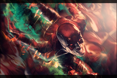
 "Need a hand?" my new sig "Need a hand?" my new sig
Hi guys,
A new one. Tried my best at smudging using the settings in the sigtutorials smudging tutorial. It seemed to have worked, but you experts out there would be able to tell better...
Also tried something new with the text. Does it look good?
Finally, I'm confused if I should lose the special effects in front of and behind the render...
As usual, all CnC deeply appreciated. 

Fireboy Version 2

Thanks in advance...
barochallo (gfxnovice)
Last edited by barochallo; 10-27-2010 at 04:05 AM.
Reason: Updating to V2
-

The smudging looks cool. The blending is nonexistent though. The render looks a little choppy too.

 = Monroe Smith IV = Monroe Smith IV
 = skeetonbeezies = skeetonbeezies
-

Thanks for the feedback.
As per your suggestion, and some ideas that came to me later, I've updated it.
I removed the over-sharpening effect by blurring the background a bit.
I also removed the circles below the text.
I changed the effects by replacing the old ones with pieces of a fractal.
Then I got the idea of adding a fireball to his finger; it seemed to go well with the scheme and background. This left me with the problem of having TWO focal points. I have tried to rectify the problem by slightly blurring the boy's face and body, and darkening the bright red background on the right. This seemed to improve the flow towards the right and also the depth.
Any suggestions?
barochallo/ gfxnovice
-

As monroe said, try to blend him in some more.
erase some parts of the render with a softbrus and an opacity of 20%
i like the smudged bg of v1. but in v2 the render looks mutch better.
overall its an good sig  keep them up keep them up 
-

I prefer v2 by alot  Maybe you could try bluring parts of the frontal C4D, and add more effects, possibly some smudging on the render to blend it in more, not sure on that one. Maybe dunno if true the sig would look good with some highlights, 10-25px softbrush any colour on lighten/other setting. Maybe you could try bluring parts of the frontal C4D, and add more effects, possibly some smudging on the render to blend it in more, not sure on that one. Maybe dunno if true the sig would look good with some highlights, 10-25px softbrush any colour on lighten/other setting.
-

background is good but the render is sharpend to much is LQ try cleaning up the render a bit bro 
Similar Threads
-
By Shamino in forum The Void
Replies: 13
Last Post: 12-19-2008, 07:50 PM
-
By Helix in forum Digital Art
Replies: 4
Last Post: 11-25-2008, 06:36 PM
-
By samson in forum The Void
Replies: 2
Last Post: 03-26-2008, 11:56 AM
-
By Henry in forum The Void
Replies: 4
Last Post: 06-04-2007, 08:53 PM
-
By Morphius in forum Digital Art
Replies: 18
Last Post: 04-29-2005, 07:13 PM
 Posting Permissions
- You may not post new threads
- You may not post replies
- You may not post attachments
- You may not edit your posts
-
Forum Rules
|


 Reply With Quote


 keep them up


