C&C
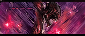
not a fan it's all over the place m8 lighting is a bit dull no deph colors dont mesh well either sry bud kiu if was me id work on lighting and color choices and blend in a bit of your bg and try keep same flow .
The vector style doesn't suit it and the color of the brushes are really dull. Considering they're a major element in this piece, it makes your whole sig dull. The left side is LQ in comparison to the right. Flow is good though. I don't understand why Sirenzo thinks it's all over the place, all the brushes are moving in one direction, lol. The colors don't compliment each other at all and therefore the blending isn't that great. Colors and a complete style change. Keep at it, ^u^!
My gift wall! My gift wall #2! My Genesis Tag Tutorial, check it out here! My Halo Tag Tutorial, check it out here!
Forum Rules


 Reply With Quote


