GFXVoid Graphic Design Forum

Remove Text Formatting
Loading...

» Online Users: 7,483

0 members and 7,483 guests
No Members online

» Site Navigation

 > FAQ

» Stats

Members: 35,442
Threads: 103,075
Posts: 826,688
Top Poster: cc.RadillacVIII (7,429)
Welcome to our newest member, Lekelindids
Results 1 to 4 of 4

Thread: lulwhat?

  1. #1
    Join Date
    Jun 2010
    Location
    ....
    Posts
    98

    Default lulwhat?

    pretty common stock

    CnC is appreciated

    F U R R E T

  2. #2

    Default

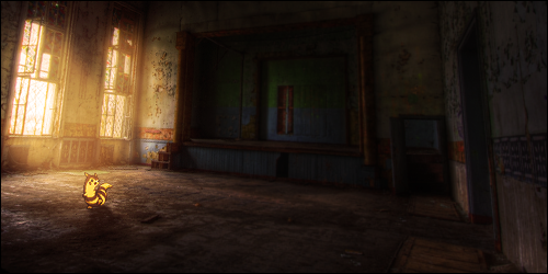
    I don't really get why, but I think it's good. The right arm is a little smudged too much, but it's alright. And the only other thing i can point out is the white line on the top right corner. Could've been erased. Overall, goodjob, keep up the good work.

    Are you new? I haven't seen a lot from you.


  3. #3
    Join Date
    Aug 2010
    Location
    Canada
    Posts
    3,286

    Default

    Welcome Ballin to the void hope to see you in the chat box soon

    Rvthm said what I would have said about the white line thing I think the fudged up arm looks good, but I think this gradient you have on top is too high lower the opacity

    KIU ^^ And hope to see more of ya

    Radi's one of a kind gift <3

    ^My Wish List^


  4. #4
    Join Date
    Jun 2010
    Location
    ....
    Posts
    98

    Default

    i joined a while ago and was sorta active but not really
    I recently became re-active
    Im a noob at sigs and i use gimp
    and the white line is my way of puting text
    Its supposed to be a sloppy m
    Last edited by ballin2much; 10-29-2010 at 07:38 PM.

    F U R R E T

Posting Permissions

  • You may not post new threads
  • You may not post replies
  • You may not post attachments
  • You may not edit your posts
  •  
Powered by vBadvanced CMPS v4.1.1