0 members and 2,099 guests
No Members online

» Site Navigation

» Stats
Members: 35,442
Threads: 103,075
Posts: 826,688
Top Poster: cc.RadillacVIII (7,429)
|
-
 Kinda fucked up but okay Kinda fucked up but okay

Compared to my previous work if you've seen it, improvement?
Cnc anyway, and give room for improvement, the lightning, focal and blending kinda got fucked up but how to fix it?
Thx.
-
Bump got to 2nd page, need some advice how to fix it please, or any CnC
Thx . .
-
-
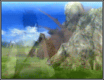
I like it I really like the "empty space to the left of him with just a hint of effect in it.
IMO you blured the wrong kinda pieces or maybe just in no real direction, I would suggest you double up the image an only use a fraction of it and more it off to the righ a little and use a low opacity smudge that will tapper off an give just the slightest hint of dissolve 
I would also suggest doubling up your blured effect on bottom left and set it on a diff setting an play around wit hti a little more or maybe try to make it appear as if this effect is actually distorting off the render itself.
You might also wanna try putting a wicked red/orange bright light someplace near the render and let it fade out towards the left.
Good stuff tho, i on the other hand think these are some pretty cool colours to work with.
KIU <3
 Radi's one of a kind gift <3
 ^My Wish List^

-
Slave stated a good point with the blurring here.
I believe that it's smart that you blurred area's that would distract your focal, but what you could've done is move your focal closer, or not resize it too much so you didn't need the blur those C4D's.
It also looks like you slightly blurred the render which wasn't necessary, imo.
The linear dodge effect C4D's on the top right look a bit random and would've looked a bit better placed on the render itself.
Try to make your focal a bit more closer and that'll give it more a 'pop'.
The C4D on the right looks out of place and just slapped on.
The lighting here is really great though, it's perfectly on and it defines the focal a lot.
The text is not too great, I advise you don't add it.
It's auto-distracting from the focal, also I don't think it looks good here, imo.
Try to experiment more with it though if you wish to.
Things to work on in the future:
- Don't resize your render too much
- Your effect placement - think about where you place them and try not to place them in an area where they stand out that much
Good work mate ^^!
-
am wondering if u could post that render pretty please cause i can't find it anyone thx
Similar Threads
-
By gr4ph1kP4ND4 in forum The Void
Replies: 12
Last Post: 04-30-2010, 09:23 PM
-
By Xelo in forum Sigs & Manips
Replies: 7
Last Post: 03-14-2010, 10:45 AM
-
By Daemon in forum Support
Replies: 11
Last Post: 08-22-2007, 09:09 PM
-
By HellBringer in forum Other Tutorials
Replies: 7
Last Post: 06-05-2006, 12:52 AM
-
By tacoX in forum Digital Art
Replies: 9
Last Post: 06-07-2005, 07:46 PM
 Posting Permissions
- You may not post new threads
- You may not post replies
- You may not post attachments
- You may not edit your posts
-
Forum Rules
|


 Reply With Quote