0 members and 514 guests
No Members online

» Site Navigation

» Stats

Members: 35,442
Threads: 103,075
Posts: 826,688
Top Poster: cc.RadillacVIII (7,429)
|
-
 FFXIII FFXIII
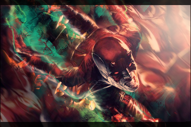
CNC please, Im still working on this tag, im just not sure what i need to do to make it look better.
I think I went a little overboard with the linear dodge.

-

The colors are dull and don't work well together. Looks like a lot of random brushing. I think it would suit you to invest some time in learning the core concepts. Everything is on the same plane, the lighting is scattered, the render is centered (and blurry), the text is detrimental, the colors need work like I said, and the blending is rather amateur. There isn't any flow either, it just looks like a mess of brushes. Don't even edit it, just put it aside and start fresh with a new tag and try to integrate some of the concepts I mentioned. Remember that whatever stock you're using should be the focus, so you want that to be clear and crisp. Whatever is behind your stock needs to be blurred some, the same goes for whatever is in front of your stock, that's what's going to give your piece some depth. When you pick a stock, make a note of where the highlights are and you should easily be able to determine which direction the light source would be coming from if there was one, and make that part of your sig the brightest part (but not necessarily a harsh white like you have here). Try to use colors to set a tone and mood to convey some type of feeling. I know I know, it's only a signature lol, but art isn't art if it doesn't give the viewer any type of feeling towards it, know what I mean? And keep it mind that reaching perfection doesn't mean there's nothing left to add, it means there's nothing left to take away. Keep it up bro.

 = Monroe Smith IV = Monroe Smith IV
 = skeetonbeezies = skeetonbeezies
-

Too much white around the render my friend.
the basics are definately there now dude
just need to remember to think about depth and lighting etc...
thanks naruto <3


 Originally Posted by littlefeet

they say until it happens they wont believe it, but if it ever does happen, they'll say it didn't actually happen. So it can actually never happen to them, even if it does happen to them
<< LOL
-

Too much white around the render my friend.
the basics are definately there now dude
just need to remember to think about depth and lighting etc...
thanks naruto <3


 Originally Posted by littlefeet

they say until it happens they wont believe it, but if it ever does happen, they'll say it didn't actually happen. So it can actually never happen to them, even if it does happen to them
<< LOL
-

Thanks guys, I will start this over from scratch. IDK I was just throwin it out there, the one I am working on now is going to have to wait. My desk top PC is being repaired and I dont have PS on my Laptop. This tag was made before my crisis one, and tbh, i dont like this signature either.
-

the bg(left/right) kinda stands out more then the render which isnt what u want
a black to transparent grad map on the sides set to softlight would possible help
Similar Threads
-
By SF.Kira in forum Sigs & Manips
Replies: 2
Last Post: 11-29-2010, 02:03 AM
-
By cc.RadillacVIII in forum Sigs & Manips
Replies: 16
Last Post: 11-15-2010, 11:39 AM
-
By oNo in forum Signature Tutorials
Replies: 3
Last Post: 06-07-2010, 01:02 AM
-
By blaz3 in forum Sigs & Manips
Replies: 6
Last Post: 05-10-2010, 09:55 PM
-
By ronenfox in forum Sigs & Manips
Replies: 2
Last Post: 06-11-2009, 07:50 PM
 Posting Permissions
- You may not post new threads
- You may not post replies
- You may not post attachments
- You may not edit your posts
-
Forum Rules
|


