0 members and 1,335 guests
No Members online

» Site Navigation

» Stats

Members: 35,442
Threads: 103,075
Posts: 826,688
Top Poster: cc.RadillacVIII (7,429)
|
-
 Storm Collision Storm Collision
-

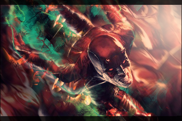
I don't mean to sound like a broken record here, but the under contrasted look and low vibrance of your signatures really isn't helping you at all. You over kill on the under contrast.
-

 Originally Posted by Fork

I don't mean to sound like a broken record here, but the under contrasted look and low vibrance of your signatures really isn't helping you at all. You over kill on the under contrast.
^^^
The concept looks really interesting, but the washed out look makes the whole thing kinda bland. I like the depth to it though kiu
-

Your work would be so much more epicer if you stop using lighten or screen or one of those for your gradients and purple is a reoccuring color for you. Spice it up use soft light with low opacities and multiply. All of those would improve your works over all quality,

My Three Rules Of Making a Sig Flow, Lighting and Depth
-

 Originally Posted by DR809

Your work would be so much more epicer if you stop using lighten or screen or one of those for your gradients and purple is a reoccuring color for you. Spice it up use soft light with low opacities and multiply. All of those would improve your works over all quality,
I think he just uses the exposure filter.
-

@Fork it's mainly the stock cloud but I add sepia looking grads over it.
@DR809 I created a new layer and set it to saturation and play with some soft brushes,which gave it a purple and orange look.
-

Same colors from before. Same lack of contrast from before. Same CnC from before. No need to reiterate what's been said time and time again by myself and others.

 = Monroe Smith IV = Monroe Smith IV
 = skeetonbeezies = skeetonbeezies
-

If i gave the PSD,could someone fix it for me?
-

Just add contrast and saturation.
-


It's not perfect, but I added some adjustment layers on top. The random neon purple bits came out too much, but yeah. I just adjusted curves, brightness/contrast, and saturation. Just tinker with your psd and adjustment layers...your work has so much more potential...don't make it look so washed out ><;

Similar Threads
-
By Reinkaos in forum Digital Art
Replies: 0
Last Post: 01-10-2010, 08:11 PM
-
By Dale in forum Sigs & Manips
Replies: 4
Last Post: 02-11-2006, 12:46 PM
-
By Dale in forum Digital Art
Replies: 5
Last Post: 02-06-2006, 03:44 PM
-
By .element in forum Digital Art
Replies: 7
Last Post: 01-28-2006, 12:53 PM
-
By SKETCHi in forum Digital Art
Replies: 14
Last Post: 02-05-2005, 12:48 AM
 Posting Permissions
- You may not post new threads
- You may not post replies
- You may not post attachments
- You may not edit your posts
-
Forum Rules
|

