0 members and 22,508 guests
No Members online

» Site Navigation
» Stats
Members: 35,442
Threads: 103,075
Posts: 826,688
Top Poster: cc.RadillacVIII (7,429)
|
-
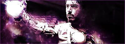
Iron Man Second Sig
No tutorial Followed... Any Ideas?
Cracks in face (over sharpen) effect of power ball in hand? i dont know really...
-
-
It does look very sharpend on the face
I do really like this sig, but im not a huge fan of the colouring
I think the classic IronMan colours (orangey/red) would suit it amazingly!
And (i think its text) on the arm needs to go imo :/
Its all there dude, just gotta do a few tweaks looks great :]
KIU!!
-
Over sharpened and over contrasted. There's not a whole lot to this composition. Really work on making it more interesting to look at by making a more effective focal point. Also, lay off the sharpen a little bit.
-
oversharpened, overcontrasted, low on compo, but theres a flow into it. maybe a bit more practice will help KIU mate
-
lower the sharpness and the contrast try a G-Blur copy over the top eras the focal might help with more depth kiu m8 not bad for 2nd
-
 Originally Posted by emsee
oversharpened, overcontrasted, low on compo, but theres a flow into it. maybe a bit more practice will help  KIU mate 
This, and it's craaazy sharp dude :P
Keep working on it man!
[My DeviantART]
{x}{x}{x}
 Originally Posted by DOMINOtm
I know what you will have to do. This may sound a bit strange but it is the only logical option, you have to seduce your teacher
Similar Threads
-
By zole in forum Sigs & Manips
Replies: 7
Last Post: 06-22-2010, 11:07 AM
-
By THAIsack in forum Sigs & Manips
Replies: 1
Last Post: 02-20-2010, 08:48 PM
-
By DeadlesS in forum Digital Art
Replies: 11
Last Post: 05-09-2009, 10:58 AM
-
By Dr D-Mento in forum Sigs & Manips
Replies: 2
Last Post: 04-12-2009, 02:43 PM
-
By nacho6777 in forum Sigs & Manips
Replies: 3
Last Post: 10-07-2008, 04:21 PM
Posting Permissions
- You may not post new threads
- You may not post replies
- You may not post attachments
- You may not edit your posts
-
Forum Rules
|