0 members and 616 guests
No Members online

» Site Navigation

» Stats

Members: 35,442
Threads: 103,075
Posts: 826,688
Top Poster: cc.RadillacVIII (7,429)
|
-
 Icequeen. Icequeen.
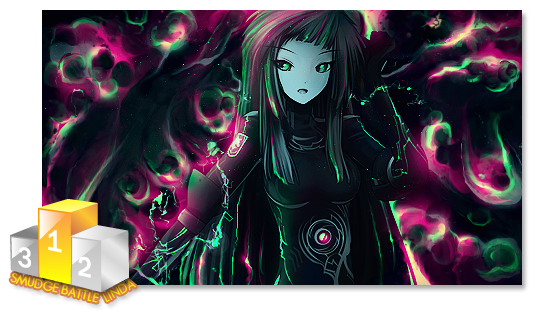
This is awefull but I tough id share anyway.
Was exercising some picture enhance techniques and was like lets make a siggy with it.
Well the enhance techniques look awesome but it does not look to well for a signature.
The dept is totaly loose and soo is the focal, but well.
Well anyways CnC are open like always 

-

The C4D looks really bad man, sorry to tell ya lol. The border is kinda odd looking. What sorta techniques where you testing out?
-

 Originally Posted by TehTaterSalad

The C4D looks really bad man, sorry to tell ya lol. The border is kinda odd looking. What sorta techniques where you testing out?
Skin harshening, in here I used some stuff to make her face look like she just walked trough a heavy snow storm.
I know the C4D looks awefull 
-
-
-

Its not bad, at all, i really like what u are trying to do there 
tho pic looks bit lq , if u resize it that way, always press and hold shift while resizing, otherways it comes out very lq :S
about c4d , i think u should place them more around the face, not really on it, try them look round, so they blend on it, by erasing some with soft brush, then try add some gradient maps, to make colours mach with each other more, blend all the picture together  and maybe try make new layer, put it on overlay, and with big 100 or 200 soft brush collour some lights with it, and creat lightening by >new layer > apply image >filters>render>Lightening.. change options u need :> and voila, sig will be outstanding! and maybe try make new layer, put it on overlay, and with big 100 or 200 soft brush collour some lights with it, and creat lightening by >new layer > apply image >filters>render>Lightening.. change options u need :> and voila, sig will be outstanding!
hope my tips will be usefull  nice art work there friend nice art work there friend 
-

 Originally Posted by Linda

Its not bad, at all, i really like what u are trying to do there 
tho pic looks bit lq , if u resize it that way, always press and hold shift while resizing, otherways it comes out very lq :S
about c4d , i think u should place them more around the face, not really on it, try them look round, so they blend on it, by erasing some with soft brush, then try add some gradient maps, to make colours mach with each other more, blend all the picture together  and maybe try make new layer, put it on overlay, and with big 100 or 200 soft brush collour some lights with it, and creat lightening by >new layer > apply image >filters>render>Lightening.. change options u need :> and voila, sig will be outstanding!
hope my tips will be usefull  nice art work there friend 
No I do not resize manualy, the picture was already LQ and then zoomed to fit the screen. Worked some blrus and sharps around to make it look more descent. I am glad yu see potential innit.
Tnx for the CnC 
 Posting Permissions
- You may not post new threads
- You may not post replies
- You may not post attachments
- You may not edit your posts
-
Forum Rules
|


 Reply With Quote


 and maybe try make new layer, put it on overlay, and with big 100 or 200 soft brush collour some lights with it, and creat lightening by >new layer > apply image >filters>render>Lightening.. change options u need :> and voila, sig will be outstanding!
