nice sig colors work well not crazy about the text use but i suppose it could slide by stick to simpler text work on your lighting i think this sig could use a bit more light coming down on him a little too dark for my style but il ike the depth and the flow k.i.u.
Genisphere - TRUeLM - VaN ZeBeN 1st Place Team Battle Collab
i love the feel to this, and the effect you did to his hair looks cool, i feel as though maybe more depth could be added to this by removing the light at the bottom left and darkening/brighting up his whole left area where needed because the shadows and the light placement there dont really add up to the light source you created, just an idea. KIU i really like this one great job
M y r m i d o n s
Midnight Marauders Plagues
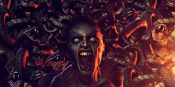
Kryptic Visons
KOTH 19winStreak
"Yeah it needs some depth to it. The blending is harsh, which can be good but it feels rather one dimensional. Maybe add a little c4d work or some burn/dodge, and I would touch up the transition between the color areas with a scatter brush and opacity with shape dynamics as well.
Also needs some shadow work. It's a bit simple but it's not a bad start.
"
also the backgound on this is WAY too simple for the effects you're using. If you want to use such a simple background I'd work on the light 2 dark transitions and then take some good time to work on some really cool blending work with the render, multi layer it and pick a blending option, clipping, smudge, blur, c4d, to really make it a whole complete piece.
Very very nice start though. I like the colors a lot and that render could make a great sig for sure. Keep it up! Thank you for sharing!


 Reply With Quote


