GFXVoid Graphic Design Forum

Remove Text Formatting
Loading...

» Online Users: 8,561

0 members and 8,561 guests
No Members online

» Site Navigation

 > FAQ

» Stats

Members: 35,442
Threads: 103,075
Posts: 826,688
Top Poster: cc.RadillacVIII (7,429)
Welcome to our newest member, Lekelindids
Results 1 to 2 of 2
  1. #1

    Default Crysis Release. (V.2)


    any better?

    (view the old one in my sig)

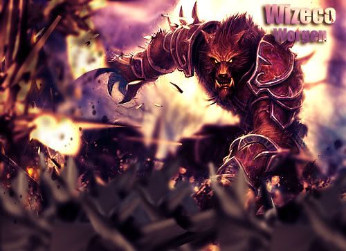
    i used a different stock and added colour this time.
    Last edited by Wiseco98; 01-09-2011 at 01:52 PM.

  2. #2
    Join Date
    Aug 2010
    Location
    Durpland.. (England)
    Posts
    329

    Default

    Its pretty sweet.
    I think its a bit too big in general imo. It all seems a bit too spaced out.
    Some blending on the render would make this a lot better, and something to fill in the left!

    Other than that, great work, KIU

    Mouuntx

Similar Threads

  1. Crysis Release.
    By Wiseco98 in forum Sigs & Manips
    Replies: 6
    Last Post: 01-08-2011, 11:17 PM
  2. Release.
    By Lith in forum Sigs & Manips
    Replies: 7
    Last Post: 04-13-2010, 08:20 PM
  3. [∞] Release PSD
    By abney317 in forum Resources
    Replies: 0
    Last Post: 03-27-2010, 01:50 PM
  4. Release
    By Wiseson in forum Digital Art
    Replies: 3
    Last Post: 11-01-2005, 04:35 PM
  5. Release
    By apeX in forum Digital Art
    Replies: 6
    Last Post: 07-17-2005, 02:46 AM

Posting Permissions

  • You may not post new threads
  • You may not post replies
  • You may not post attachments
  • You may not edit your posts
  •  
Powered by vBadvanced CMPS v4.1.1