GFXVoid Graphic Design Forum

Remove Text Formatting
Loading...

» Online Users: 3,428

0 members and 3,428 guests
No Members online

» Site Navigation

 > FAQ

» Stats

Members: 35,442
Threads: 103,075
Posts: 826,688
Top Poster: cc.RadillacVIII (7,429)
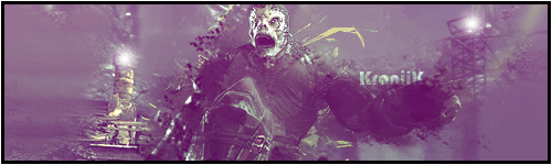
Welcome to our newest member, Lekelindids
Results 1 to 10 of 10
  1. #1

    Default Gears of War Siggy 4 Fun !


    just did it for fun... what you think ?
    Proud Owner of:
    RichFlyers
    Skype: NovruzeliHuseynov


    ^ LOVE YOU RAD ^


  2. #2
    Join Date
    Nov 2010
    Location
    Canada
    Posts
    214

    Default

    too much c4d and you cant see the render at all >.< only the head. also the bg is monotone and is very boring. Bring your render out on top and give your siggy a sense of direction. Also try to add a light source because atm it looks like you raised the brightness on the siggy too much which makes it look odd and you cant distinguish between the nose and the mouth for example. good attempt but keep the focal, the focal

    E2
    van Zeben


  3. #3

    Default

    kk ty...
    Proud Owner of:
    RichFlyers
    Skype: NovruzeliHuseynov


    ^ LOVE YOU RAD ^


  4. #4
    Join Date
    Nov 2010
    Location
    Canada
    Posts
    214

    Default

    sorry something i had to add. you dont need to fit the whole render into the siggy, resize the siggy size to fit with the render if you get me. also try to make the render larger and have as little empty space as possible

    E2
    van Zeben


  5. #5

    Default

    v2 (fully changed):
    Proud Owner of:
    RichFlyers
    Skype: NovruzeliHuseynov


    ^ LOVE YOU RAD ^


  6. #6
    Join Date
    Dec 2006
    Posts
    5,223

    Default

    wow i would try bringing back more of your focal looks to me u smudged it all out except the head and arm . the c4d is fine and i would also try making focal a bit larger and work on lighting a bit more try to folow the light on the render or stock aLready
    kiu m8


    oops didnt see v2 and v2 is way better gj m8 kiu only thing is the animation is a bit distracting and confusing .


  7. #7
    Join Date
    Mar 2010
    Location
    U.S
    Posts
    1,509

    Default

    v2 is sexy, its a little monotone and not to keen on the animation but your gettin there with this, some well places c4d's to create some more flow and depth and your set, work on lighting too, kiu
    M y r m i d o n s
    Midnight Marauders
    Plagues
    Kryptic Visons

    KOTH 19winStreak


  8. #8

    Default

    haha ty... will remove the animation, i just put there as a test xD... gotta send the .psd to email cuz im in class now xD
    Proud Owner of:
    RichFlyers
    Skype: NovruzeliHuseynov


    ^ LOVE YOU RAD ^


  9. #9

    Default

    v3:
    Proud Owner of:
    RichFlyers
    Skype: NovruzeliHuseynov


    ^ LOVE YOU RAD ^


  10. #10

    Default

    no comments on v3 ?????
    Proud Owner of:
    RichFlyers
    Skype: NovruzeliHuseynov


    ^ LOVE YOU RAD ^


Similar Threads

  1. Gears of War Tag #2
    By Nonpro in forum Sigs & Manips
    Replies: 3
    Last Post: 12-01-2008, 12:03 PM
  2. Gears
    By K00L4ID in forum Sigs & Manips
    Replies: 4
    Last Post: 11-17-2008, 04:26 PM
  3. Gears Of War Art
    By confusedGFX in forum Digital Art
    Replies: 1
    Last Post: 10-07-2008, 09:24 PM
  4. Gears Of War Sig
    By Shadow in forum Sigs & Manips
    Replies: 12
    Last Post: 03-02-2007, 10:18 PM
  5. gears of war
    By Xander in forum Sigs & Manips
    Replies: 3
    Last Post: 09-29-2006, 08:52 PM

Posting Permissions

  • You may not post new threads
  • You may not post replies
  • You may not post attachments
  • You may not edit your posts
  •  
Powered by vBadvanced CMPS v4.1.1