0 members and 4,581 guests
No Members online

» Site Navigation

» Stats
Members: 35,442
Threads: 103,075
Posts: 826,688
Top Poster: cc.RadillacVIII (7,429)
|
-
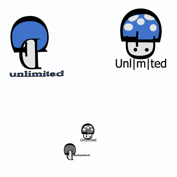
 Attempt in making a logo in college Attempt in making a logo in college
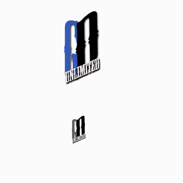
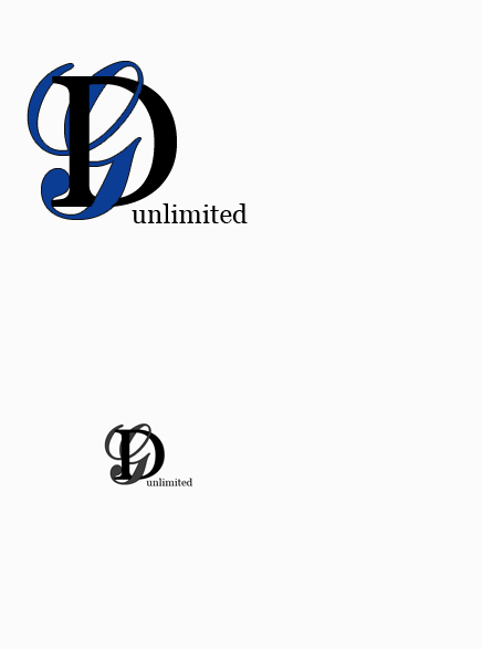
this one was my favorite out of them all :P
-
I think the mushroom one is definitely the most creative, I really like it.
I also like this one because it's clean, and straight to the point.
I know jack about designing logos, but I think you did pretty good haha xD
-
tx hosh :P glad u like it i got a B+ in that class for these lol
-
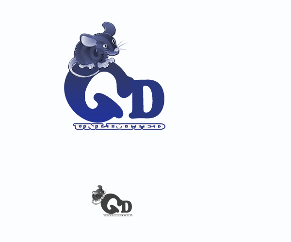
I like the first one with mouse but the problem is that the stock watermark is on it  .... if you could get it clean it looks nice. .... if you could get it clean it looks nice.
Skype: NovruzeliHuseynov

^ LOVE YOU RAD ^
-
Nice job man, mushroom one is my favourite. What was the company you made up? What do they do?
-
-
I dont make sigs anymore
-
tx guys was gfx designs unlimited was my old gfx site i tried running with friends
-
 Originally Posted by sirenzo

tx guys was gfx designs unlimited was my old gfx site i tried running with friends
ahh i see then. I asked because the first one (with the mouse) I would say is the best if the company has something to do with mice (makes mousetraps, other shit[not too sure what but meh]), and i was wondering what the logo would represent. I still stand by what i said before.
is the best
E2
van Zeben


-
I would like to say that, given that the question "However what is this "company" for... like what do they do?" had to be asked speaks volumes.
When you make these logo concept walk through segments, you still need to tie it to the company. Based on the images along, it could be anything from pest control, to hydroponics. Usually the only time people put initials within a logo, are when the initials are a persons name. An example is, years back there was a corner store near were I lived called "J D Market" and we never knew what the J or D stood for. After a while I asked the owner about it, and he didn't know, so I asked who he bought it from, and it turned out it was the persons initials.
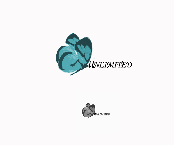
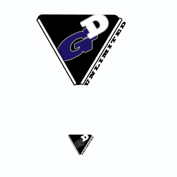
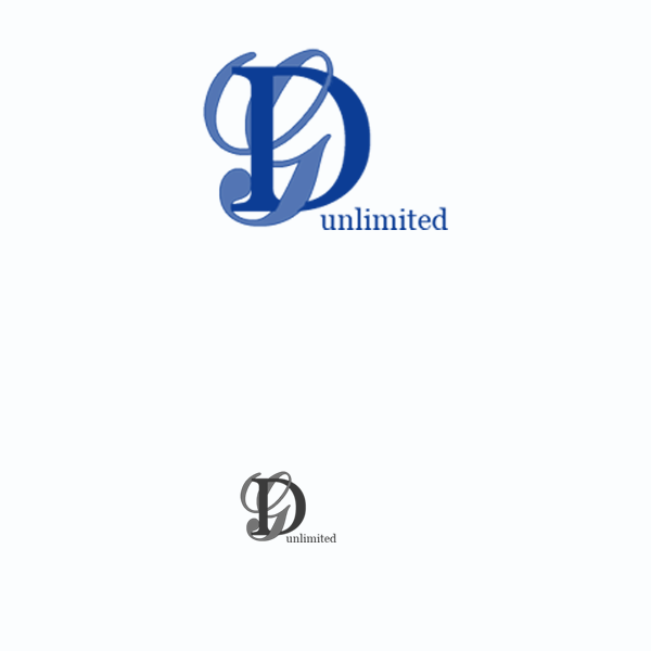
As for clarity, the mushroom, old western script, and butterfly are bad, since it is hard to make out the G or D.
Other than that, they look fairly good.

Commissions and stickers available via linktree here.
Similar Threads
-
By Bradley in forum The Void
Replies: 35
Last Post: 11-15-2006, 04:25 PM
-
By tacoX in forum The Void
Replies: 16
Last Post: 08-13-2005, 08:32 PM
 Posting Permissions
- You may not post new threads
- You may not post replies
- You may not post attachments
- You may not edit your posts
-
Forum Rules
|


 Reply With Quote
 Thanks JDragon <3


