0 members and 380 guests
No Members online

» Site Navigation

» Stats
Members: 35,442
Threads: 103,075
Posts: 826,688
Top Poster: cc.RadillacVIII (7,429)
|
-
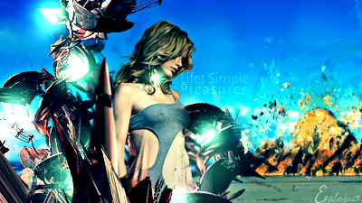
 Devil May Cry Devil May Cry
A start:

-
-
 Originally Posted by Liquid

Its really monotone, it also seems kinda flat in both depth and effects
really could not have said it better, i do like that it appears that you used actual c4ds, versus brushes (like your current signature)
-
Besides the posts above, it looks pretty over contrasted, thats forcing it to be LQ. Effects aren't bad. Nice try, but i know u can do better!
Similar Threads
-
By Linda in forum Sigs & Manips
Replies: 8
Last Post: 01-01-2011, 07:29 PM
-
By AntiEmperor in forum Sigs & Manips
Replies: 4
Last Post: 08-10-2008, 11:47 AM
-
By Smiling Demon in forum Sigs & Manips
Replies: 0
Last Post: 05-07-2007, 07:54 AM
-
By Chucks in forum Digital Art
Replies: 5
Last Post: 05-07-2007, 07:35 AM
-
By Toshiyan in forum Digital Art
Replies: 5
Last Post: 01-10-2007, 09:21 PM
 Posting Permissions
- You may not post new threads
- You may not post replies
- You may not post attachments
- You may not edit your posts
-
Forum Rules
|


 Reply With Quote