0 members and 2,233 guests
No Members online

» Site Navigation
» Stats
Members: 35,442
Threads: 103,075
Posts: 826,688
Top Poster: cc.RadillacVIII (7,429)
|
-
Splinter Cell Sig
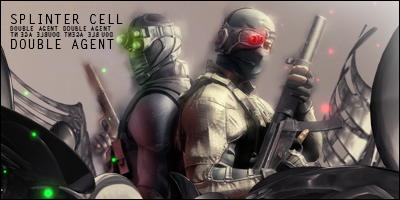
Okay, here is a Splinter Cell Sig i made just now took me like 10 mins, im extremely happy with it because i think it looks good. . .but it doesnt have a smudge backround! Rate and CnC please!

Now, i am also trying to learn how to use stocks as a BG so if you have the time, could you post a pic of what stock you put for the BG?
Thanks,
Kinetics
-
-
See, the thing is apart from smudge BG's idk what to do for a BG, what would you do in this situation?
-
 Originally Posted by Kinetics
See, the thing is apart from smudge BG's idk what to do for a BG, what would you do in this situation?
follow some tuts ^_^
E2
van Zeben
-
add in some clipping mask or some c4ds and smudge in parts of it not all .? maybe best of luck kiu
-
try taking your renders and combining them to fill your bg, then merge those layers together and duplicate a bunch of times
then add effects to those layers like liquify, wave, twirl, ripple.....erase the parts of those layers that don't flow with your concept
then burn/dodge the areas you think need it....next just paste your render on top and blend it in with the bg
^^ thats sig design in 5 minutes
-
V2 is here, thanks for the help guys!
-
V2 is alot better than the first. I love the colored orbs for each character, very nice. The text is interesting, i like how you did it. Uhmm, the background on v2 looks better than that of v1 but it looks weird all the way to the left? other than that, nice job
A Gift from Liquid, Thanks Buddy!
________________________________________

-
yeah, i see what yo mean all the way to the left, i will try to fix later on, in the mean time thanks for noticing the colored orb things, i hoped someone would notice
-
Don't think you should have smudged the heads so much. In fact you should rarely smudge heads. Only on some occasions where there is a definite outline from the stock it was cut from and you want it look smoother but in this case looks off. Just get rid of that smudge IMO.
The mine dots look pretty cool but needs definitely some better effects and background.
Similar Threads
-
By Shamino in forum The Void
Replies: 0
Last Post: 12-13-2005, 12:34 AM
-
By Sobek in forum Digital Art
Replies: 10
Last Post: 10-06-2005, 05:13 PM
-
By Tai-Pan in forum Sigs & Manips
Replies: 20
Last Post: 08-30-2005, 03:43 AM
-
By Dante in forum Sigs & Manips
Replies: 5
Last Post: 07-06-2005, 02:01 AM
-
By Juicy in forum Sigs & Manips
Replies: 7
Last Post: 05-20-2005, 07:36 AM
Posting Permissions
- You may not post new threads
- You may not post replies
- You may not post attachments
- You may not edit your posts
-
Forum Rules
|