GFXVoid Graphic Design Forum

Remove Text Formatting
Loading...

» Online Users: 2,611

0 members and 2,611 guests
No Members online

» Site Navigation

 > FAQ

» Stats

Members: 35,442
Threads: 103,075
Posts: 826,688
Top Poster: cc.RadillacVIII (7,429)
Welcome to our newest member, Lekelindids
Results 1 to 4 of 4

Thread: Simple

  1. #1
    Join Date
    Jan 2011
    Location
    Oceanside, CA
    Posts
    184

    Default Simple

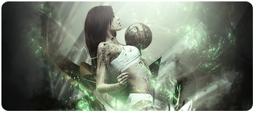
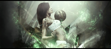
    Well just got done with this sig just a few minutes ago. I'm still experimenting away from the style of my older sigs, I'm really out of my comfort zone thanks to you all . I think I'm happy with the outcome. Still working on my use of c4d and flow.

    So tell me what you all think. :]


    No border:

    Sexy gift from Slave! <3


  2. #2
    Join Date
    Dec 2006
    Posts
    5,223

    Default

    v2 looks better your cs4 needs some blending looks weired but nice colors kiu


  3. #3
    Join Date
    Jun 2010
    Location
    Under your bed
    Posts
    3,385

    Default

    great colours, as Sire said c4ds need blending more. i love the flow tho but it lacks depth, Try adding some and also v.2 is better imo GJ and KIU

  4. #4

    Default

    Aww, sick!!!!!!!


Similar Threads

  1. a simple sig....
    By DragonsRage in forum Sigs & Manips
    Replies: 11
    Last Post: 12-23-2005, 01:21 AM
  2. Simple and last of the day
    By AntidotexXx in forum Sigs & Manips
    Replies: 3
    Last Post: 12-03-2005, 07:58 AM
  3. New one..simple
    By Cenoix in forum Digital Art
    Replies: 16
    Last Post: 07-21-2005, 07:33 AM
  4. Simple PSP sig
    By Pleymo in forum Sigs & Manips
    Replies: 3
    Last Post: 06-07-2005, 11:44 AM

Posting Permissions

  • You may not post new threads
  • You may not post replies
  • You may not post attachments
  • You may not edit your posts
  •  
Powered by vBadvanced CMPS v4.1.1