0 members and 1,026 guests
No Members online

» Site Navigation

» Stats

Members: 35,442
Threads: 103,075
Posts: 826,688
Top Poster: cc.RadillacVIII (7,429)
|
-
 Throwaway signatures from Claro battle Throwaway signatures from Claro battle

I usually don't ask for CnC but I might as well with these throw aways..
Here was the one that got picked to battle..

-

As you know, i think they are all awesome 
-
-

Yeah, agree with kritez, if i had too chose a favorite i would choose the Assassins creed one
great use of fractals.
Kiu man.
-

which one he had 2 of them i too would of like the assassin creed one with green effects i really like last one too tho i dunno seems to dull to me like the colors just the colors don't pop as much as id like to see but very gj on all kiu
-

Well they're all great  but the green one. but the green one.
-

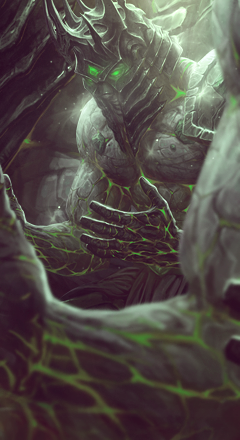
On the 3rd one, did you blur the front guy yourself or did it come in a stock like that?
as I guessing you did blur him, instead of just doing filter>blur use the Lens Blur tool to create a more pleasing blur when something comes out that far, it takes a little bit to learn (set the shape to Octagon 8 for best looking blur).
What that does is blurs it like a camera lens would, it would get rid of small details a heck of a lot better then blur does which makes it less distracting and makes our eye go towards the focal even better. It's just more pleasing to the eye.
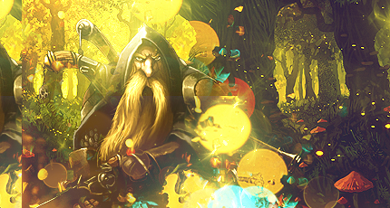
Favs are def the 2nd and 3rd one though. The last one just isn't getting me, I kinda want some black blacks in there because there are a few solid whites there. Also my eye doesn't really know where it wants to go, either the dwarf or the trees on the right. If you flipped the right side around, so the path in between the trees pointed towards the dwarf it would flow sooooo much better (your eye would follow the path to the dwarf instead of getting sucked back into it). But as I guess, you didn't make the background, or it's one big stock, so I won't hold it against ya, but so help me if I meet the creator.
-

1st tag needs more glitter and sparkle, but its 8/10 very nice.
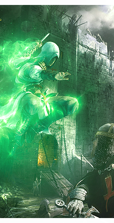
2nd tag is hot but with all that flowing green glow it feels a little one sided, maybe add some
cool things to the guy fighting his like green vs black good vs evil or something.
3rd tag is very very very nice but I would like to see the large render that is in the front tweaked a little bit so you cant tell it's his arm/hands and it looks like lava rock instead, and then maybe some subtle rays of light or something behind that forefront render and infront of everything else to make it look like he's in a cave or something? Maybe i'm crazy.
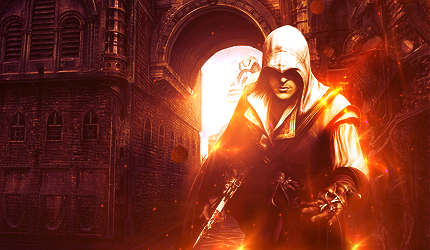
4th one is HOT TO DEATH. 10/10.
The one they picked...meh...but they picked it so apparently I don't know what I'm talking about.
-

I dont make sigs anymore
-

 Originally Posted by schultz

so pro...
Lol, you have more skill Schultz, your tags are awesome.
Similar Threads
-
By cC.Aleksander in forum Digital Art
Replies: 1
Last Post: 01-14-2011, 05:28 AM
-
By Emsee in forum Sigs & Manips
Replies: 6
Last Post: 01-03-2011, 08:50 AM
-
By Avatar in forum Digital Art
Replies: 5
Last Post: 11-12-2010, 07:51 AM
 Posting Permissions
- You may not post new threads
- You may not post replies
- You may not post attachments
- You may not edit your posts
-
Forum Rules
|
