GFXVoid Graphic Design Forum

Remove Text Formatting
Loading...

» Online Users: 13,182

0 members and 13,182 guests
No Members online

» Site Navigation

 > FAQ

» Stats

Members: 35,442
Threads: 103,075
Posts: 826,688
Top Poster: cc.RadillacVIII (7,429)
Welcome to our newest member, Lekelindids
Results 1 to 3 of 3

Thread: Lately...

  1. #1
    Join Date
    Aug 2010
    Location
    New Port Richey, Florida, Usa, Earth, Milky Way, Universe
    Posts
    77

    Default Lately...

    CnC Plox.

    HATE THIS ONE:


    Favorite:


    Newest:


  2. #2
    Join Date
    May 2010
    Posts
    1,942

    Default

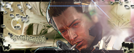
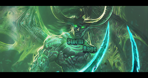
    A lot of them lack the major elements required in order for signature/tag to look good.

    First off is your typography which is completely unnecessary, auto-distracting and unappealing. Avoid it.

    Borders. Drop them, bottom line, they don't add anything to the sig.
    Effects. I would advise you stop using brushing and trying some smudging and C4D's just to get a basic start off some effects.

    Lighting, flow, depth. All of that needs work on.
    The void has a lot of tutorials that'll help you improve.

    Keep it up!


    My gift wall!
    My gift wall #2!
    My Genesis Tag Tutorial, check it out here!
    My Halo Tag Tutorial, check it out here!


  3. #3
    Join Date
    Aug 2010
    Location
    New Port Richey, Florida, Usa, Earth, Milky Way, Universe
    Posts
    77

    Default

    Thanks. I love good CnC like this, it really helps me improve. Thank a bunch!


    Favorite:


    Newest:


Posting Permissions

  • You may not post new threads
  • You may not post replies
  • You may not post attachments
  • You may not edit your posts
  •  
Powered by vBadvanced CMPS v4.1.1