GFXVoid Graphic Design Forum

Remove Text Formatting
Loading...

» Online Users: 1,124

0 members and 1,124 guests
No Members online

» Site Navigation

 > FAQ

» Stats

Members: 35,442
Threads: 103,075
Posts: 826,688
Top Poster: cc.RadillacVIII (7,429)
Welcome to our newest member, Lekelindids
Results 1 to 4 of 4
  1. #1
    Join Date
    Jan 2011
    Location
    CAIRO
    Posts
    8

    Default .. MY NEW SPIDER DES ..

    WELCOME


    ...

    RENDER


    HERE

    ...


    DES

    ...


    ...


    cnc pls?


    ...

    BYE


    Last edited by HALMOS; 02-14-2011 at 12:22 PM.
    MY.DS
    ~!~~~~!~

    ~!~~~~!~

    ~!~~~~!~

  2. #2
    Join Date
    Nov 2008
    Location
    USA - New Hampshire
    Posts
    627

    Default

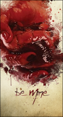
    Background looks overcontrasted and the text doesn't match the style of the signature. I don't think this is your best work

  3. #3
    Join Date
    Nov 2010
    Posts
    301

    Default

    I actually like the text and feel of this..however I feel that the background is a tad blurred too much.

  4. #4
    Join Date
    Dec 2006
    Posts
    5,223

    Default

    take off some of that blur layer and bring back some of your bg to the piece it be stronger tag imo


Similar Threads

  1. Spider Pig
    By cC.ShorterGFX in forum Sigs & Manips
    Replies: 8
    Last Post: 06-09-2009, 02:42 PM
  2. another spider O.o
    By Lew in forum Sigs & Manips
    Replies: 1
    Last Post: 06-30-2008, 06:48 PM
  3. SPider Man
    By Hellion in forum Digital Art
    Replies: 5
    Last Post: 11-25-2007, 04:39 PM
  4. Spider-man
    By .dJBiO in forum Digital Art
    Replies: 14
    Last Post: 07-16-2005, 08:21 PM
  5. New spider man
    By ghetto fab in forum Sigs & Manips
    Replies: 9
    Last Post: 02-25-2005, 04:48 PM

Posting Permissions

  • You may not post new threads
  • You may not post replies
  • You may not post attachments
  • You may not edit your posts
  •  
Powered by vBadvanced CMPS v4.1.1