0 members and 839 guests
No Members online

» Site Navigation

» Stats
Members: 35,442
Threads: 103,075
Posts: 826,688
Top Poster: cc.RadillacVIII (7,429)
|
-
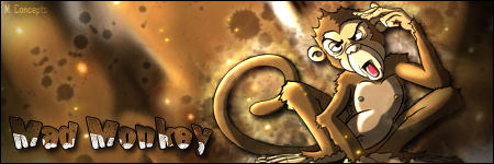
 My Latest Designs My Latest Designs
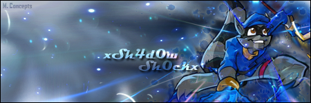
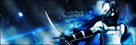
Let me know what you think of these, guys! I've been reading review after review for days on end now, and I think it's starting to payoff!  They're in order from oldest to newest (the oldest is a few days old, and the newest I just finished; the "Way of the Samurai" graphic). They're in order from oldest to newest (the oldest is a few days old, and the newest I just finished; the "Way of the Samurai" graphic).
Last edited by xSh4d0w Sh0cKx; 03-02-2011 at 05:43 AM.
-
I can definitely see you're getting better. I like your most recent one. nice colors. I would avoid using Stroke on text if you can avoid it. also, try to not use drop shadow on your renders. You can get a more realistic drop shadow effect by using the burn tool below the render.  Keep it up. Keep it up.
-
Thanks, Anthony! I'm going to play around with my latest one and see if I can't get the burn tool to leave a better shadow effect! Thanks for the tip.
-
New rule for you, Don't use the preset layer styles when designing font.
-
New render of the "Way of the Samurai" posted; removed the stroke from the text, and removed the drop shadow from the render, using the burn tool to make the shadow instead.
-
Good colour choices and design ideas man!
Check out the Tuts this site has to offer, and I can see you making some great work!
BTW, Samurai one is awesome!
KIU
-
Thanks, Mount!
I've been watching tutorial after tutorial on YouTube, and reading them like crazy as well on various websites (this one included). I've got a ton of them saved to my computer to take a look at if I get stuck on a design, and need a hint on how to get it to flow and turn out better. I hope that doesn't make me any less of a designer. :/
-
Nah its all part of the learning process mate!
Try different techniques, using tuts, and post em up! we give great advice on pieces dont hesitate to post!
Look forward to seeing some work bro
-
Made some changes to the "Way of the Samurai" design.
-
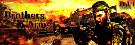
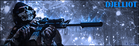
Made this for a Black Ops Forum user; just finished it. Before you comment on the text not blending well with the image, know that he wanted it that way.
And yes, that is a REAL LIFE render of Ghost from Modern Warfare 2.
Similar Threads
-
By tyg in forum Digital Art
Replies: 5
Last Post: 01-24-2007, 09:17 PM
-
By El-Ko in forum Sigs & Manips
Replies: 5
Last Post: 03-10-2006, 08:14 PM
-
By trevorlee_nc in forum Digital Art
Replies: 1
Last Post: 07-11-2005, 10:35 AM
-
By Agony in forum Digital Art
Replies: 11
Last Post: 02-17-2005, 08:03 PM
 Posting Permissions
- You may not post new threads
- You may not post replies
- You may not post attachments
- You may not edit your posts
-
Forum Rules
|


 Reply With Quote


