0 members and 1,690 guests
No Members online

» Site Navigation

» Stats
Members: 35,442
Threads: 103,075
Posts: 826,688
Top Poster: cc.RadillacVIII (7,429)
|
-
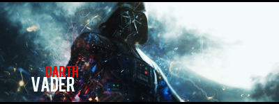
 Darth Vader Darth Vader
BACK! With something new! CnC as usual. :3
-
colors doesnt match and some random effects, except for that it is very good, oh and text is too small, except for those i love it KIU
-
I wanted it to look like there's different things going on in him not randomly slap them. But thanks a lot man. 
-
-
-
I like the old text better. Just make it bigger
-
1 to small 2 too big, i like it, idk why, the effects are cool. kiu.
-
lol....your here wolf...im commandom4a1 from sfph forums by the way...
@topic
looks lq to me..but the effects are nice though
 ^thanks for the epic gift AGITATOR!
-
Oh its him...
O hai EJ. I learned from Shaheenster that smaller text = better because there is less distraction and focal loss. So , yeah.
-
 Originally Posted by Wolf'

Oh its him...
O hai EJ. I learned from Shaheenster that smaller text = better because there is less distraction and focal loss. So , yeah.
Yeah its him.
Yeah thats right, but make not that small, and make it more visible.
Similar Threads
-
By burnknight5 in forum Signature Tutorials
Replies: 2
Last Post: 02-28-2011, 10:51 PM
-
By schultz in forum Sigs & Manips
Replies: 5
Last Post: 01-01-2011, 12:44 AM
-
By Dron in forum Sigs & Manips
Replies: 0
Last Post: 03-13-2010, 05:29 PM
-
By elixile in forum Sigs & Manips
Replies: 4
Last Post: 07-27-2008, 08:05 PM
-
By Xoligy in forum Sigs & Manips
Replies: 3
Last Post: 05-10-2005, 06:08 PM
 Posting Permissions
- You may not post new threads
- You may not post replies
- You may not post attachments
- You may not edit your posts
-
Forum Rules
|


 Reply With Quote