0 members and 1,722 guests
No Members online

» Site Navigation

» Stats
Members: 35,442
Threads: 103,075
Posts: 826,688
Top Poster: cc.RadillacVIII (7,429)
|
-
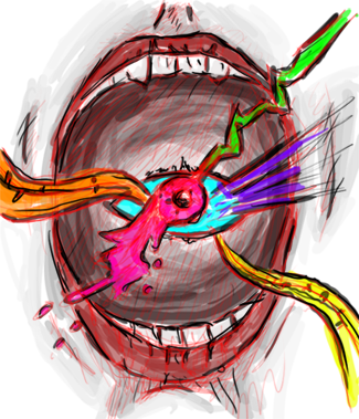
 Jin Kazama looking for worthy opponent... Jin Kazama looking for worthy opponent...

V1

V2

V3
I just know..something is missing...and it's pissing me off...
Last edited by Strid3r 9Y0; 04-04-2011 at 08:07 AM.
-
I think you miss HQ effects, flow and better text.
Also you should reach for a better focal point. This one's to much to the left side.
Tho the effects aren't HQ, they still look pretty fitting ;D.
-
You know if the signature was smaller you wouldn't have such a large space to have to try and add to, sometimes big is a bad thing.
-
 ^thanks for the epic gift AGITATOR!
-
That's the thing...don't know how to make this so called "crispy" and "HQ" sruff...
-
Tutorials man, they're awesome, plenty of them on the forums too, check them out 
-
Well..uploaded V3,text is a mess but I've added some sharpness,few adjusting layers and e filter,though I can see where's my mistakes,like JDragon said,sometimes big isn't always better.Maybe it's time to think more tech and be less effects zealous..
-
3 is a big improvement work with a smaller canvas and try to see what you can come up with then, it'll help you improve quicker then working with such a large one.
Similar Threads
-
By i2fly in forum Digital Art
Replies: 3
Last Post: 07-25-2009, 09:45 PM
-
By qwasian in forum Digital Art
Replies: 1
Last Post: 07-21-2009, 06:12 PM
-
By Outlaw in forum Digital Art
Replies: 2
Last Post: 08-30-2005, 06:46 AM
-
By Outlaw in forum Digital Art
Replies: 5
Last Post: 08-30-2005, 04:57 AM
-
By MrkLrn13 in forum Digital Art
Replies: 8
Last Post: 08-21-2005, 10:57 PM
 Posting Permissions
- You may not post new threads
- You may not post replies
- You may not post attachments
- You may not edit your posts
-
Forum Rules
|


 Reply With Quote