stock: [link] cnc?
deviantART - Behance
v2
i saw the stock and i said "WOW" i really like what you did here maybe you should add some title or text like "alone" ....and btw i like v2 better
^thanks for the epic gift AGITATOR! SOTW:261|265|288|308 |edwinpabito.deviantart.com
Great photomanip. Nothing over the top and it sets a nice tone. I agree, version two is better. I would blend some skulls into the ground, maybe even put a decapitated head in his hand to give it a little more oomph, but that's personal preference.
= Monroe Smith IV = skeetonbeezies
V2 is smex.
PLAGUES GIFTS: Timentia Gaaf wrftw formerly known as Yakuto
This is wicked on so many levels. Good to see you're still making epic work soggywaffls.
I like v2 more.. It have better colors and stunning atmosphere. great work mate!
Epic Maze by RadillacVIII
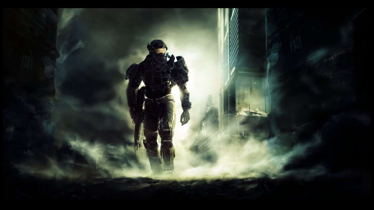
haha thanks havent had time to work on this cuz i was doing it over spring break and spring break ended =[ good thing school ends soon still WIP still not sure if an urban setting is a good idea, but im trying it out
Last edited by s0ggywaffls; 06-03-2011 at 11:33 PM.
That version 2 is sweeeet!! And so is Halo Reach!
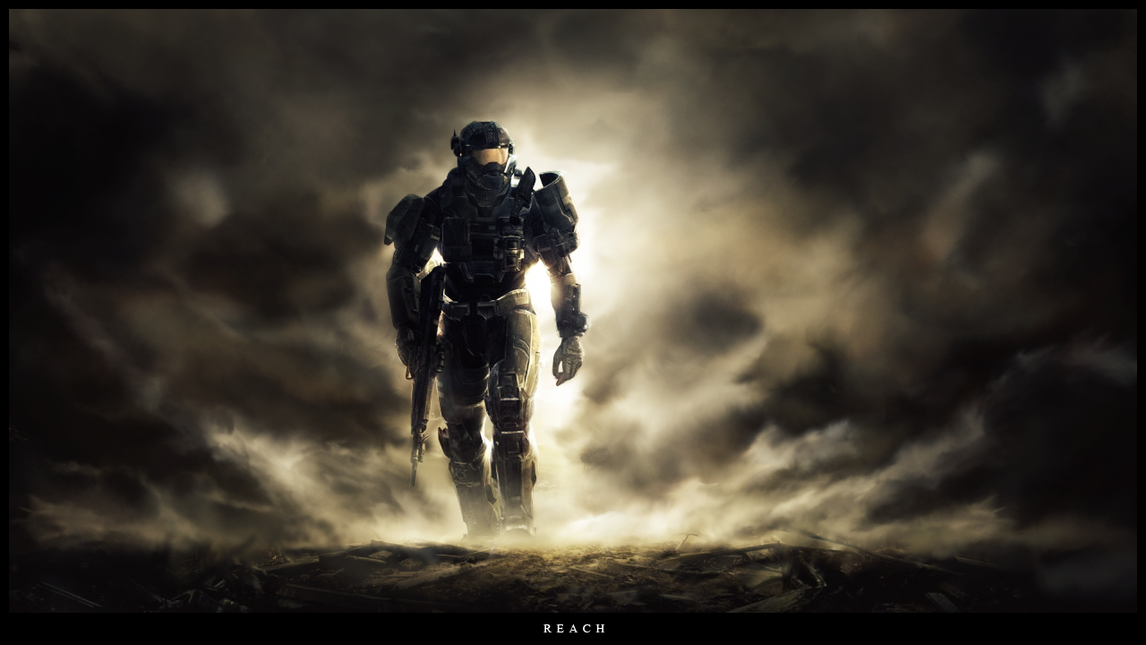
Colors are better in v2, but I prefer the desolate feel the yellow background gives it in v1, sick work mate.
deviantART paint pixels Morphine ♥ ketg ♥ Teletubby ♥ wrftw ♥ Imagine ♥ ketg ♥x2
Forum Rules


 Reply With Quote
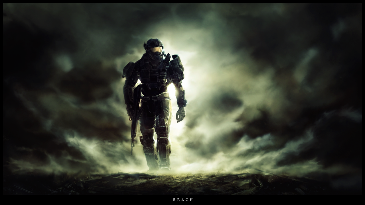


 And so is Halo Reach!
